Introducing a new Project Diary – designing and building a new home in New Zealand.
This Project Diary features the Andersons, a family of 5. We’ve previously met them in another Undercover Architect Project Diary. (You can check that out here)
The Anderson family got an offer they couldn’t refuse to relocate back to New Zealand, which is where they’re originally from. They put their home on the market, it sold quickly and they found a large block of land in New Zealand.
They worked with me to create design for their home, and they’re now working with a local draftsperson, builder and other consultants to kick their project off.
And they’ve kindly invited us along for the ride. So, over the coming months, I’ll be sharing more information, as well as photos and videos from their building site in New Zealand.
Whilst I’ve never seen it in person, the Andersons are awesome at photographing the progress, and even taking drone footage. So, you’ll get a great chance to see how this project unfolds in the months ahead.
In this instalment, I share with you how the Andersons briefed me on their needs, wants and wishes for this home, and the designs I created as a result.
So, let’s start with the Anderson’s Brief.
I always say that the best briefs tell a story about who you are as a family. How you like to spend your time both in and beyond your home. What your dreams and hopes are for your future lifestyle in your home. And ultimately how you want your home to feel, and how you want to feel in your home.
This is actually the third project I’ve designed for this family, and they’re good friends of ours too, so it helps that I know them very well. But I always love hearing directly from the homeowners how they like to spend their time, and the dreams they have for their home. And, I also knew that this project was very different to the others we’ve done together.
The dream
This is truly a forever and dream home. It’s a big deal that the Andersons have moved back to New Zealand where they both grew up, and have bought a large block of land to build on. There’s a big vision for this home, and so I knew the design was going to need to tick a lot of very personal boxes for this family.
The family
The Andersons are a family of 5, including 3 Primary-School-aged kids. The home will need to suit them as they grow over the years to come. There’ll also be guests who come to stay, and the potential for Clare’s mum to move in down the track – so there’s the possibility to create accommodation for her too. And a lot of their family are in New Zealand and nearby, so this home will also be a hub for celebrations and get togethers.
The site
The site is large, at 5,500m2. It’s a large rectangle, secluded and private at the end of a cul-de-sac, and north-to-rear. The thing that really struck me about it when I saw the photos and footage was just how big the sky seemed. Equally sized blocks surround this block, and there’s a fair amount of vegetation around. So, it’s lovely and private and has this expansive view of sky and green-ness. I knew that capturing that sense of big, expansive sky would be important in the design, but also ensuring it didn’t overwhelm the intimacy of the home either.
Drone footage of the block of land – or ‘section’ as they call it in New Zealand.
The room requirements
- As for the rooms, they were seeking, this was the basic list:
- Master bedroom with walk in robe and ensuite, and some separation of this space from the kids’ bedrooms
- 3 kids’ bedrooms all similarly sized with large robes
- open plan kitchen with a butler’s pantry, dining and lounge with a fireplace (and no television)
- second living space which needs to accommodate a family heirloom – a full sized billiard table
- an outdoor area with a fireplace
- a mudroom connected as access into the home from the garage
- a study area for the kids
- a small study nook near the kitchen for a home command station
- an area outside for the dog to hang out in the shade
- possibility for a swimming pool
- granny flat style self-contained accommodation for guests and Clare’s mum down the track
There were some other personal nuances and requirements for specific spaces and pieces of furniture that needed to be housed. And also some elements related to the services infrastructure required for an acreage block, and the types of services the home would have on site.
The feelings
I always talk about how important it is, when you’re designing your new home or renovation, that you think about how you want it to feel – and how you want to feel in it. This is a question I ask at the beginning of my design process, and it’s something I encourage homeowners to revisit regularly as they make the myriad of decisions and choices throughout their project.
Clare had a great way to describe the feeling she wanted this home to have. And it’s actually one that many homeowners tell me. She said …
“When you enter the living space of the home, you feel welcomed, like your favourite blanket wrapped around you in front of a roaring fire on a cold wet day outside, and that you never want to leave”.
It’s gorgeous isn’t it … because you can immediately place yourself in that feeling. And the beauty of doing this, of using this as a steering force in your project, is that it helps focus on what’s really going to deliver that feeling.
Clare said also “When I visualise living in this home, I feel the main living area as a sundrenched space of natural warmth, openly connected to the outdoor world, but equally protected from the harsher NZ climate. Sunlight and daylight play a major part in this vision, natural warmth and plenty of spaces to curl up in with a good book and coffee in the sunshine.”
The learnings
Given this is the 3rd project we’ve worked on together, and the 2nd brand new home, there was also the opportunity to examine what would be done differently from the previous homes.
Most of these ‘learnings’ or things that the Andersons wanted to do differently were related to the extra space this site would give them in their home. Their previous home was built on 405m2. This site is 5,500m2. So, there’s the chance to be more generous with the spaces in and around the home.
There’s also specific things related to the climatic conditions of New Zealand. Winters can be longer, colder and harsher than their previous home in Brisbane.
The design approach
So, how did this all inform my design approach?
Well, if you listened to the podcast episode on designing for an acreage site, you’ll know there’s a specific approach for a site of this size and type.
The land area gives us the opportunity to put everything on one level, and create a strong, on-grade, indoor / outdoor connection. However, we also need to be sure the home doesn’t get carried away with itself, and become bigger than it needs to be.
Early on, Clare, Darren and I talked about pavilion style homes. Clare showed me a series of images on a Pinterest board that showed other projects with strong forms of delineated pavilions for sleeping and living.
I knew that high ceilings, big volumes and views to sky were going to be part of making the most of that expansive view. And Clare also had some ideas for dark colours, strong forms, and interesting materials that I wanted to use the design to make a big impact with.
Positioning the home on the site
I talk in the podcast episode about designing for acreage sites about how important the siting of the home becomes, and how this factors into the overall masterplan for the site.
The Andersons wanted to build a shed for storage of larger items required for maintaining the block. These things didn’t necessarily have to go into the garage. So, if a shed was to be built, it was a case of how we would situate that so it wouldn’t sit in the way of the home’s view.
There was also infrastructure of tanks and the like, and how they’d be accommodated to best serve the home, and not impact its outlook.
Of course, however the home was designed, it needed to make the most of the orientation and the outlook.
Privacy is handled largely by the distance between the site and other homes in the area, and some existing and established vegetation on the site. So we had a great opportunity to really get the home positioned for orientation without worrying to much about overlooking.
I did, however, want to ensure that the approach to the home enabled privatisation of the home and its landscaped area. As the home is located at the end of the cul de sac … and you’ll see this if you check out the drawings on the website … the access into the site is on a corner of it.
So, I wanted people to drive in and have somewhere out of the way to park. And I wanted the arrival at the home to not be all about presenting the garaging, but that the entry to the home itself was clear, you got a glimpse of its architecture, yet didn’t expose the insides of the home too much.
There was also an opportunity to explore a few different ways of aggregating spaces and rooms.
The thing with home design is that you’re not simply creating a bunch of rooms and putting them together. You’re creating relationships between spaces that then can determine who regularly uses those spaces, and how they get used in the life of the home overall.
For example, the Andersons had already said that they wanted their master bedroom area to be separated from the kids’ bedrooms.
However, did this separation need to be significant, with the master suite located on one side of the house, and the kids’ bedrooms in a separate wing on the other side? Or could it be sufficiently separated in how the circulation was arranged so Clare and Darren didn’t walk past the kids’ bedrooms on their way to their own bed?
Another example is the second living space.
It was going to be a big room given its need to accommodate a full-sized billiard table, and then the perimeter space you need to put around the table so you can actually play on it. We’d spoke about the possibility of moving furniture around in that room when the billiard table got played so the room didn’t get too large. However, I was keen to explore whether it was possible to get that room working without needing to push furniture around at different times. It was then a case of looking at whether the second living space was associated with the main kitchen / dining and living area of the home, or more closely associated with the kids’ bedrooms. That relationship would change how the room was used over time.
The design of the home
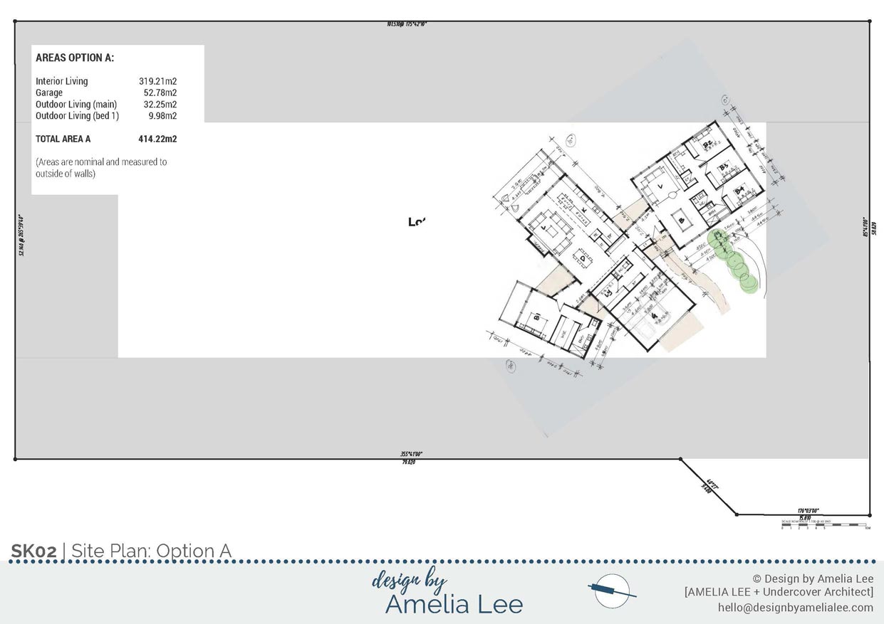
I created 3 options for the design.
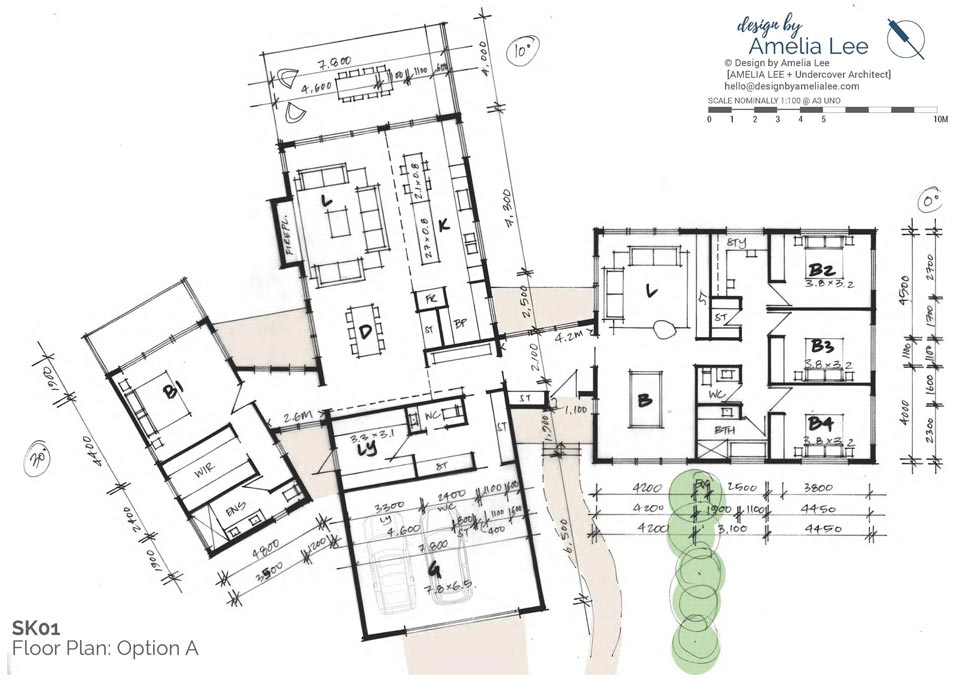
The first option
The first option was all about pavilions. The central pavilion contained the main living, kitchen and dining area at one end, and the garage at the other. Between the garage and the home was a series of service areas … the laundry, a mud room and a guest toilet.
The kids bedrooms were then in a separate pavilion, with their bathroom, a study area and linen store. This pavilion also contained the second living space, with the billiard table.
The master suite was in another pavilion, with its walk-in-robe and ensuite.
The pavilions were arranged that the main living one was at the centre, and the bedrooms pavilions then on each side, separated by the main living pavilion in the middle. The entry into the home was in a connection zone between the living pavilion and the kids’ bedroom pavilion.
The way the home was arranged enabled the two living areas to have a relationship with each other … you could see between the pavilions from one living space to another. The outdoor entertaining area also connected them externally. However, they were separated and the second living space clearly associated with the kids’ bedrooms.
OPTION A: Site Plan
OPTION A: Floor Plan
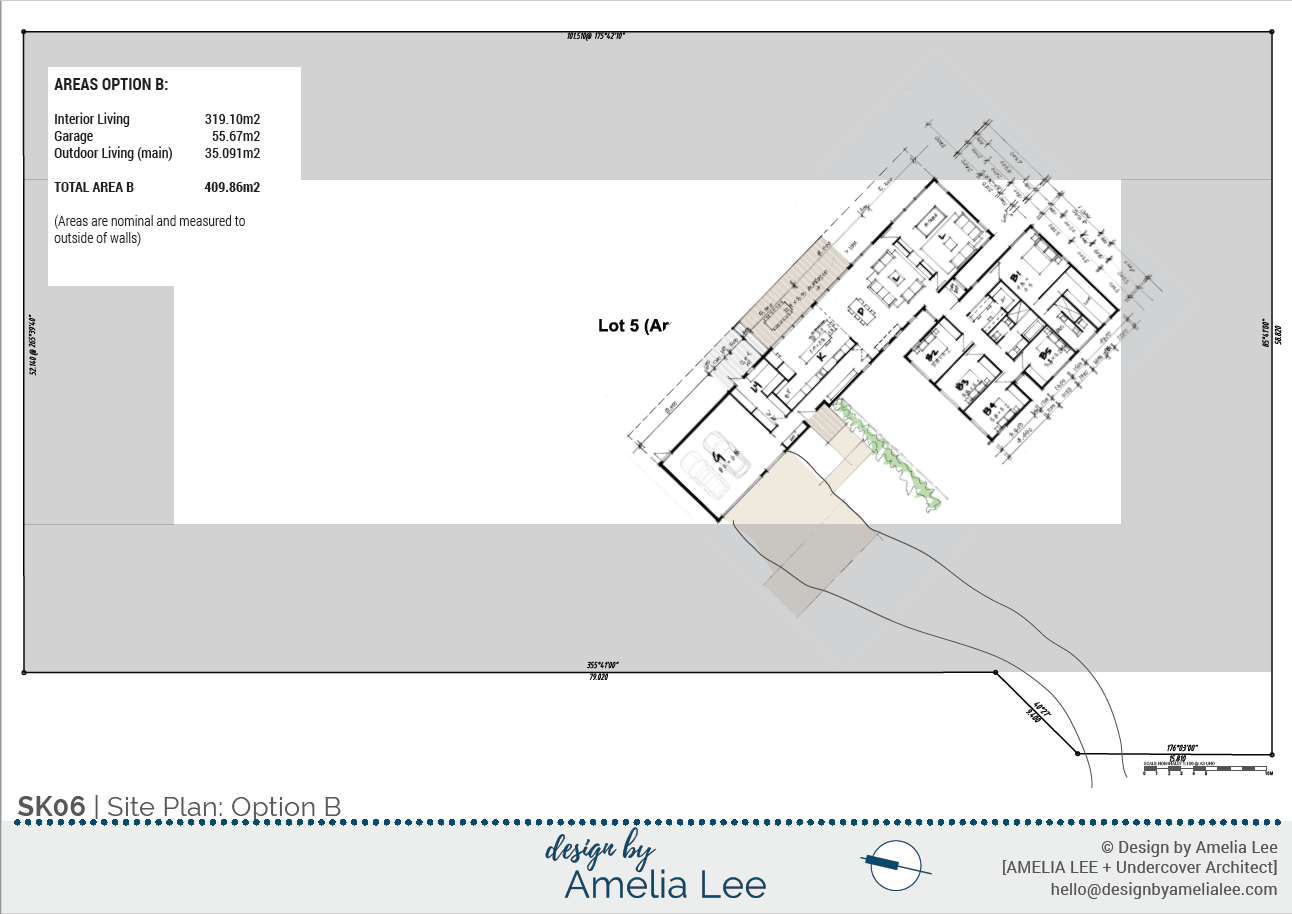
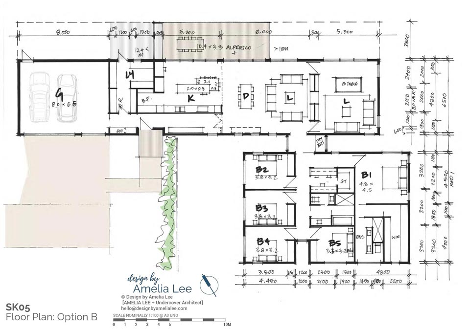
The second option
The second option was also a pavilion design, however rooms were arranged to have a different relationship to each other.
So, in this design, the main pavilion contained the kitchen / living and dining area. It also contained the garage, laundry and mud room. The second living area now sat as part of this pavilion as well.
The two living spaces were adjacent to each other. They were separated by a thick storage wall which served both spaces, and also housed a fire place. There were doors shown to close off the living spaces from each other, but I saw a visual continuity happening between them, with the storage and fireplace element being a strong feature element in the spaces. We even talked about there being glass around it, so you could see the ceiling continue through from one living space to the other and get that visual connection and light the whole way through … whilst having acoustic separation of the two rooms.
A second pavilion in this design contained all the sleeping areas. The master suite was accessed off one part of the hallway, and privatised from the kids’ bedrooms. A family bath and study area sat in the middle of the pavilion, and the 3 kids’ bedrooms then ran along the opposite edge of the pavilion.
This option also introduced the idea of a guest bedroom. Something we’d spoken about was how Clare’s mum could be accommodated in the future. We’d discussed whether this would be in a self-contained granny flat, or within the home but still feeling separate. And then there was the idea of how guests would be accommodated as well, and whether these elements would be the same thing.
This option suggested that the home contain a guest bedroom.
This could be used to accommodate visiting friends – and I joked that I’d designed it for when we visit. And then Clare’s mum could actually be involved in the design of her own granny flat on the site when the time came. She could live in the guest bedroom if need be whilst the granny flat was being built as well … but this option would mean the home always had that spare bedroom for guests long term.
OPTION B: Floor Plan
The third option
The third option created a more aggregated home. Formwise, I envisaged it would still have a central, higher core over the living spaces, but the home was far more ‘together’ than the pavilion options of the first two designs.
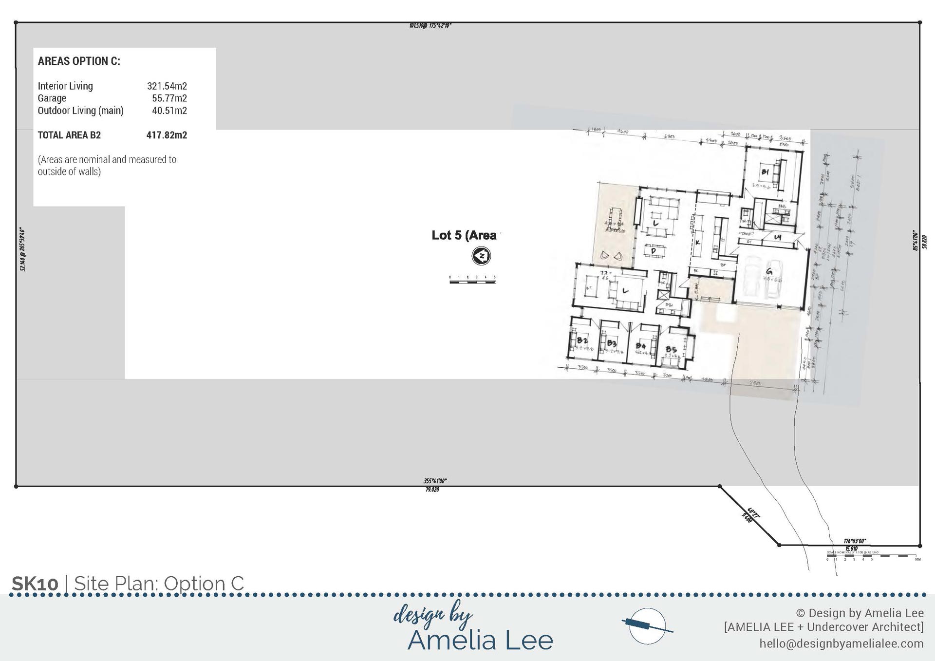
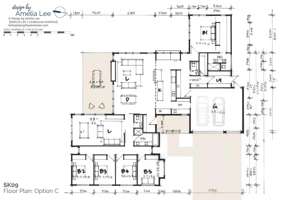
In this design, the master bedroom and kids bedrooms were on opposite sides of the central living area. The kitchen, living and dining area sat at the centre. Garaging connected into the home via the laundry and mud room. There was also direct access from the garage into the butler’s pantry in this option.
The central living space almost acted as a core, whilst the rest of the home pinwheeled around it.
The second living space sat as a separate space and room that could be closed off. It sat near the main living and dining area, and both living spaces directly accessed the outdoor entertaining area – and were visually connected to each other across this space as well.
This option also included a guest bedroom, and this room also incorporated a study area for the kids.
OPTION C: Site Plan
OPTION C: Floor Plan
Which option?
So which option did they choose?
Well, each was going to create a different home architecturally. There were significant form differences between each of these homes. There were also different relationships between the kids bedrooms and master suite, and how the second living space was positioned in the house.
I find that, as a designer, when you sit down to design a home for someone, you are literally making thousands of decisions to create a design for them that satisfies their wants and needs.
In most cases, you can create 2 or 3 design options that capture those wants and needs, but will also throw up more ideas. For example, someone may say “I want our bedroom to be separate from the kids’ bedrooms” … but how separate do you want it. Do you want it to be in a different wing of the home. Or do you simply want it to be separate enough to feel private from each other?
My approach has always been that I’d rather show the homeowners the main options that are possible, so they can determine their priorities, rather than me make all those decisions on their behalf and only show them one option.
It’s usually not until you see the design drawn that you realise “oh, I thought I wanted that, but I actually prefer it done that way”. Or “I didn’t think of that, and now I think that would be awesome to include”.
I find I’m already making so many decisions on the client’s behalf that to offer up a few different options ensures they can make the most important decisions themselves. I just need to present options that actually work, so then they can sort their priorities and determine which is the best fit for their needs and dreams.
So, which option did they choose? Well, you’ll have to follow along on the website to see. I’ll be blogging about this project as progress happens on site.
Make sure you’re a member of the UA Community and receive the weekly UA News – so you’re the first to know when we update you on progress. You can join the UA Community and get your free “How to Design a Home” E-Guide by heading here.
This blog post is a transcript of the podcast episode which you can listen to here >>>
The post Designing and Building a New Home in New Zealand | Update #01 appeared first on Undercover Architect.
