How can a restaurant design inspire your home?
Here are 5 restaurant-inspired design ideas to consider (from Enigma Barcelona by Pau Llimona and RR Arquitectus) to help your home feel great.
But before I dive into that, let me share some exciting news!
If you follow Undercover Architect on Facebook or Instagram, you may have seen I recently travelled to the USA. The idea for this trip started late last year, and in January, I booked it all and started getting really excited about heading off on the first overseas trip I’ve had on my own since I was in my late 20s!
See, for some time now, I’ve had gorgeous American members of the UA Community get in touch with me and ask if my courses are relevant for them. Some American homeowners have even joined the Australian versions of both my 6 week online course “How to Get it Right in Your Reno or New Home” and the home construction course “Manage Your Build”.
And so, in the back burner of UA, I’ve been learning more and more about remodeling and building in the USA so as to be more helpful American homeowners. The thing is – it is similar to how we in Australia do it. However, there are terminology differences, and some process differences … and of course, the orientation thing is flipped, with the sun moving through the south and not the north!
About a year ago, I discovered an architect with an amazing YouTube channel that shares his knowledge, experience and insight on practicing as an architect. His name is Eric Reinholdt, and his channel and business is called “30X40 DESIGN.WORKSHOP”. He’s based in Maine, right up in the north-eastern corner of the USA.
His YouTube channel is the most watched architectural YouTube channel, with over 180,000 subscribers at the time of this recording … and climbing.
The videos are gold … whether you’re a homeowner, or in the industry … they’re so beautifully put together, and share a huge wealth of advice and education to demystify what it’s like to both work with an architect, and to be an architect. I really encourage you to check them out, subscribe and follow along – head here for more info.
Anyway, about a year ago, I emailed Eric to congratulate him on such awesome work, and to introduce myself. We kept emailing, and then a few months later, jumped on Skype. I suggested to Eric that we collaborate on something. And then when they announced that the American Institute of Architects’ National Conference was to be in New York city at the end of June, well, let’s just say I took it as a sign I needed to get myself over there!!
So, to the reasons for my trip … it was definitely a research trip … to understand more about the remodeling and building industry in America. Part of that was attending the AIA Conference in New York, which also included a huge Building Expo as well.
This is a recent video where Eric shared his experience of attending the American Institute of Architects’ Conference in New York.
However the main reason was to be able to hang out with Eric in person, and be able to collaborate and create something together. And that’s the exciting news I have to share.
EXCITING NEWS FOR AMERICAN MEMBERS OF THE UA COMMUNITY
Eric and I have created a new online course together. It’s called “The Welcome Home Course” and it will teach you how to confidently remodel or build your future family home – and get it right.
Eric and I have over 40 years combined industry experience in residential design, remodeling and building. In The Welcome Home Course, we’re diving into what you need to know to successfully design, remodel or build your home, and how to avoid the expensive mistakes, heartache and drama along the way.
There’ll also be other industry experts to support you in your learning, and give local insights for your region, climate and specific challenges. I’ve been to the USA a few times now, and it never ceases to amaze me how big it is, and the diversity of environment and natural conditions from state to state … and so this course is crafted to really guide and help you wherever you’re located in the USA.
This course is specifically for USA homeowners. However, if you’re in the USA design, building industry and want more insight into residential home remodeling or building, this will also be awesome for you – as in it, we take you through the step-by-step process from start to finish of a remodel or new build project.
We seriously can’t wait to bring The Welcome Home Course to you. Having worked with hundreds of Australian homeowners in this way (and already a few Americans), I personally know how great it is in empowering you for your remodel or new build, so you can enjoy the process and successfully create that fantastic home you’re dreaming of.
So, if you’d like to be the first to know when it’s available to join, head to www.undercoverarchitect.com/usawaitlist and pop your details in there.
OK, now on with the podcast and blog!
5 Restaurant-Inspired Design Ideas to Consider for your Home Design to Feel Great
In this episode, I’m talking about a project I learnt about, which is actually an incredible restaurant in Barcelona. It may sound strange to talk about this, and your home, but stick with me here, because I feel there’s always things to learn about our home design when we look at how other project types are working in the built environment.
So, when I was in New York, I attended an event at the HG Stones Showroom. HG Stones is a stone supplier that does a huge range of natural and engineered stones, and they’re located in New York City.
At this event, Pau Llimona, a Spanish architect, talked about the design of a project called “Enigma”. This is a restaurant in Barcelona, where a maximum of 24 diners per evening are taken on a journey that melds food, theatre and the materiality and design of the spaces.
Enigma is a restaurant owned by Spanish chef, Albert Adrià, who is a renowned chef. Let me tell you a little about what happens when you go to Engima.
As I said, there’s a maximum of 24 diners in the restaurant. When you make your booking, you’re assigned a time-slot to arrive, as no more than 6 diners can enter the restaurant at one time. There’s no reception, no welcome desk. You’re given a pin code to use on the external security panel to let yourself into the restaurant once your group of 6 is assembled. Once inside the restaurant, you walk alone, through a winding corridor until you arrive into the restaurant’s first space, and start your evening’s experience.
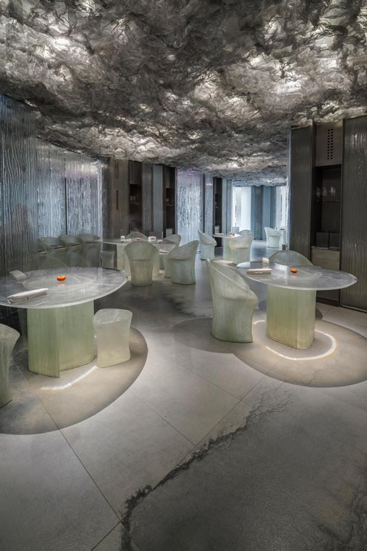 Image Source >>> archdaily
RCR Arquitectes/Pau Llimona
The evening involves travelling through a series of rooms in a specific order inside the 750m2 or 7,534 square foot space … as you enjoy 40 courses in an experience that can take up to 4 hours to complete (!)
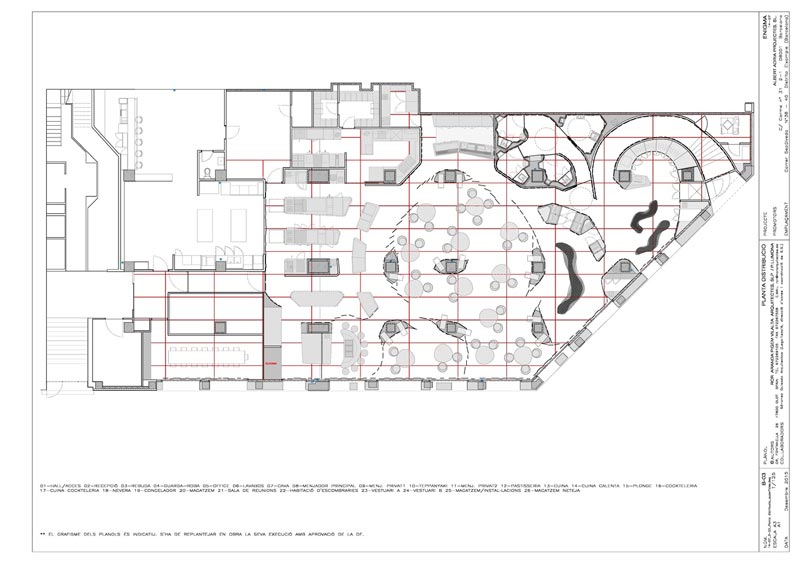 IMAGE SOURCE >>> archdaily
RCR Arquitectes / Pau Llimona
The price? Yes, that was one of my questions too. From memory, it was around 220 Euros per person, plus alcohol. This is bucket list stuff.
Everything is custom made in the restaurant … right down to the plates you eat from. One of the main things Pau spoke about was how the wall linings and floor had been created.
A company called Neolith worked with the design team to help create a really unique wall and floor lining for the restaurant, using their Sintered Stone product. What’s Sintered Stone? Well, let me read a quote for you that explains it from The Creative Kitchen and Bathroom website.
“Sintered stone is created through a kiln-fired process that heats and applies pressure to a mineral blend until it binds together. In short, it’s synthesizing the process by which igneous rock is formed. Not only is sintered stone UV-stable and chemical resistant, it has the best compressive strength of any comparable products currently on the market. Sintered stone also has no warping and essentially no thermal expansion, regardless of temperature and moisture changes. Not to mention it’s completely non-porous and will not stain.”
So, super durable. Super hard-wearing. And this is a product that is available throughout USA, Europe and Australia and can be used as tiles, benchtops, wall cladding … all sorts of applications.
How was Sintered Stone used in this project? Well, a series of watercolour paintings were enlarged, and then applied in a grid formation over the entire floor and wall linings of the space.
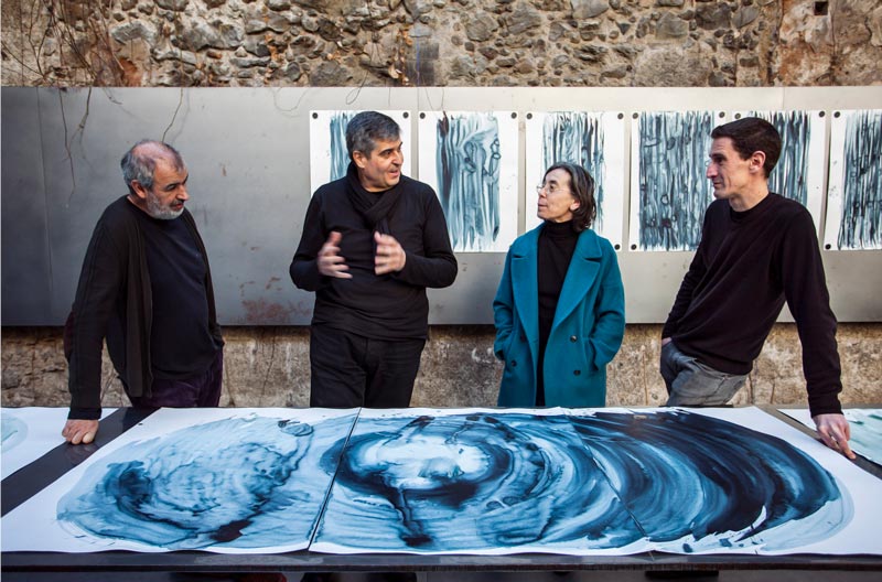 Image Source >>> Archdaily
RCR Arquitectes / Pau Llimona (Pau is on the right, and these are the watercolour images that were used)
 Image Source >>> Archdaily
RCR Arquitectes/Pau Llimona
A watercolour painting about the size of a 6 seater dining table … then got enlarged and then divided into a grid pattern where each piece of stone shows one small part of that painting. Each stone piece was printed with its part of the grid, and then these individual stone tiles were used to line the walls and floor of the restaurant. Each stone tile was approximately 3m x 1m … so very large format.
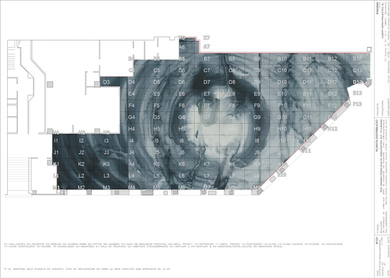 IMAGE SOURCE >>> archdaily
RCR Arquitectes / Pau Llimona
It was really fascinating to see how this really added to the sense of drama and theatre in the space … so much more than choosing an off-the-shelf finish. Of course, other elements really added to this. The furniture design, the lighting played a big part, the ceiling was designed to look like a series of clouds, all backlit and glowing.
It was honestly mind-blowing. I asked Pau how involved he was in designing the experience … I was really curious whether the chef, and his team, had come with a pre-defined idea of how the restaurant experience would occur, and then got Pau to basically design the various rooms to accommodate it. Or whether they’d collaboratively worked it all out together.
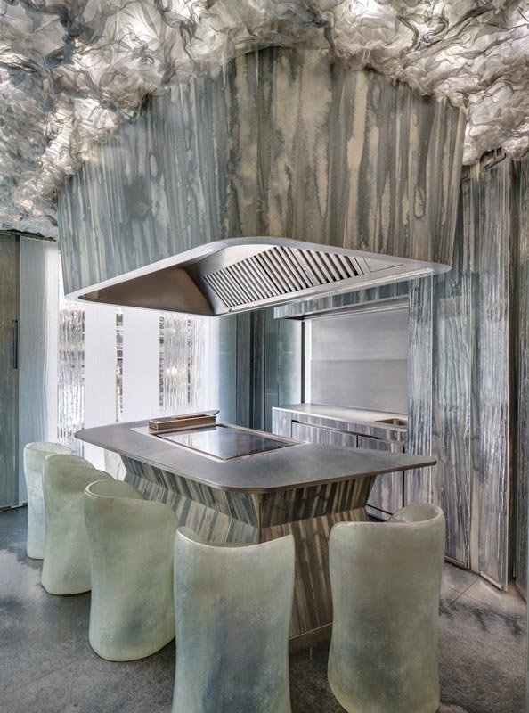 Image Source >>> archdaily
RCR Arquitectes/Pau Llimona
Pau told me the design process had taken over 12 months. He showed me images of how they’d mocked up the experience inside the actual venue before finalising the design … using cardboard boxes for tables and chairs, and plastic curtains to mimic the glass panelled walls.
They’d all worked together as a team, so the restaurant staff were really involved in understanding how the architecture was going to create the dining experience they’d be delivering. That actually seemed to be one of the things Pau most enjoyed about it … the way everyone had brought those collaborative skills together.
So, what does this have to do with your home?
Well, I’ve got 5 things I’d love you to think about, that are inspired by this project. These 5 things are:
#1 experience
#2 materials
#3 lighting
#4 customisation
#5 your team
So let me go into more detail on each of these.
#1 Think about Experience
What is the experience of your home?
To start thinking about this, think about how do you arrive in your home, and how do your guests arrive? What is revealed at the point of entry … vs when you get to come further into the home? Some homes really suffer from putting everything on display at the front door … or from people arriving and feeling like they’re simply falling into the home with no ceremony at all.
You can picture the theatre of this restaurant … that wonderment of walking in, mouth open, as you start to discover the spaces and you’re invited to explore.
How can you bring theatre of experience to your home? This may sound weird and the opposite of homely … but this is exactly where the idea of entry voids first came from. These grand statements on entering a home, that have over time become more and more compact, but still often people are asking for entry voids, or something that adds drama at that point of arrival into their home.
If you check out the Anderson project, you’ll see we created an entry experience, where the home is screened as you arrive at the front door. A long wall, which the Andersons painted a dark navy colour, and sat a long church pew, with a collection of artwork and photos, gave an immediate ‘taste’ of the feel of the home … without revealing the home to those they didn’t want to.
Functionally, it gave somewhere for guests to put down their bags as they walked in … but this idea of walking into this screened space, taking a small journey into the home, and then turning around this wall to have the home open up to you – with its light and open space, and connection to outdoors … that adds to the experience of arrival. It emphasises the feelings of those spaces by reinforcing how they feel each time someone walks in.
For those entering for the first time, it was often a surprise of “wow, this home is much bigger and more spacious than I thought” … because that entry process concealed the volume and space of the home. For the homeowners, it acts as a small transition space between the public world, and the haven of their home, that enables them to feel they’ve arrived home each time they enter it.
Start looking at other homes you walk into … even public spaces you move around. How has entry, and threshold, and movement from public to private, been handled to make it feel ceremonial, and important that you’re coming ‘home’ to a space or place? This can make a big difference to your home’s ability to welcome you each day, and to make your guests feel welcome too. I find most homeowners want their home to embrace them like a hug … they may not say it in such woo woo terms … but that idea that your home’s architecture can do this is very real. Think about how this works at your place.
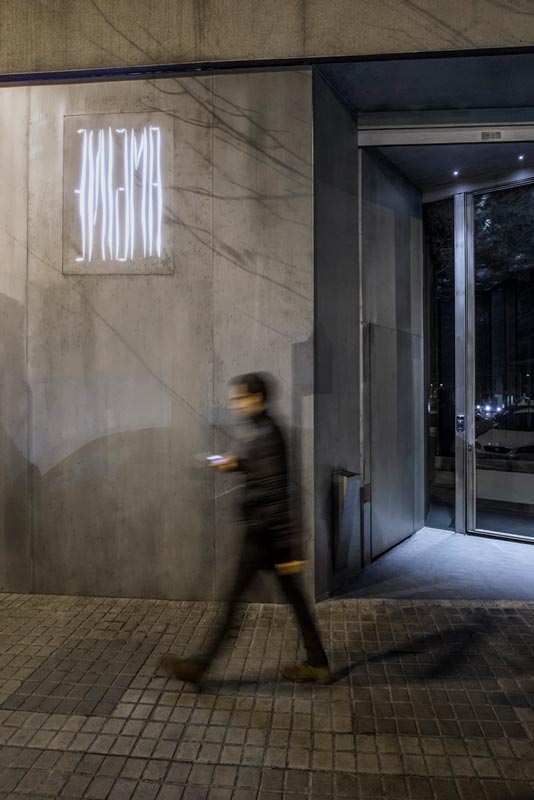 Image Source >>> Archdaily
RCR Arquitectes/Pau Llimona
#2 Think about Materials you use
The sintered stone used at the restaurant, and the way its surfaces were printed, of course added a richness and drama to the interior design of the restaurant. And whilst incredibly spectacular, it came at a cost premium and is not in everyone’s budget.
Yet, it was specifically chosen for a series of reasons, not just how it looked. Any wall and floor surface had to be hard-wearing and easy to clean to satisfy the needs of a restaurant. It also had to create a certain atmosphere of intimacy and comfort without feeling cold or hard. And it needed to create something that was memorable in the restaurant. Materials need to do a lot of jobs in a space.
So, what I’d love you to think about here is how you choose materials, and what you want them to do for you and your home.
Materials can be thought about in a few different ways … and I think we forget this because residential construction uses a pretty standard palette of products, finishes and materials, so we may feel we don’t have a lot of options … but we actually do!
I recommend first and foremost that you choose materials for durability and longevity. Especially anything that’s structural, or on the exterior of your home, or in a location that makes it difficult to replace or maintain.
You want your home to help you relax. So, staring every weekend at the material finish you chose that’s rapidly deteriorating, needing refinishing, or needs you to hire someone to sort it out at a cost you didn’t anticipate … none of that is going to help you relax. And our homes take daily punishment – so it’s important the materials we build it from can sustain that daily life and still look great.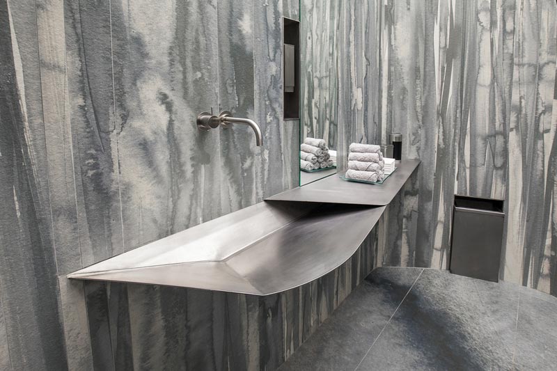 Image Source >>> archdaily
RCR Arquitectes/Pau Llimona
Think also about choosing materials for the life and character they give a space. This can come through texture and pattern, and also how they reflect or absorb light. Whilst you may not be able to fund getting an original artwork printed onto the surface of materials you choose, there are SO MANY OPTIONS available in residential materials these days to add colour, texture, pattern and light to spaces … that will add richness to your design and the way your home feels overall.
I always suggest that you think about the materials you come into contact with, that you might brush your hand over as you walk into your home, or that are eye and hand level in your daily use of your home. We often forget the sense of touch and how it can change our experience of something.
Say, for example, you have fallen in love with a particular natural stone you’d love to use on the outside of your place. Your budget may not extend to wrapping it around your home’s exterior. But perhaps you can afford a low landscape wall as you walk into your home that’s made from it. Or it could be used in a section of your entry landing as you arrive at your home.
Small touches like this, when sitting in amongst a simple, complimentary palette, can help these materials have specialness and impact, and enrich the experience of your home. And don’t fake it … choose the real deal if you want it to look a certain way. Materials that mimic something they’re not can create a real disconnect in the integrity and authenticity of a space and home.
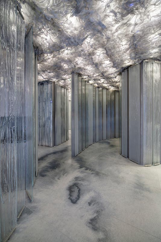 Image Source >>> archdaily
RCR Arquitectes / Pau Llimona
#3 Think about Lighting
Electrical lighting in a home, from what I see happen for homeowners, often gets left until the quoting stage. Or worse still, gets left until construction is underway, and the electrician requests a layout and final selections.
I really encourage you to design your electrical lighting solution with the same intent that you’re giving the floor plan, the exterior of your home, and all the internal finishes and fixtures.
You can see from this restaurant, how impactful the lighting is for creating mood, drama and atmosphere, whilst also needed to satisfy the functionality of being able to see what you’re eating, and not trip over each other as you move through the space.
How do you want your home to feel once the sun goes down? What will you need specific lighting levels for to make spaces work … for relaxation, or for doing homework, or for entertaining, or to be safe and secure.
Think about this as you create the floorplan, and picture how it will be laid out. Because you’ll be frustrated on a daily basis if you don’t get this right, and its super expensive to retrofit after you’ve finished. It’s important to incorporate the design of this early into your project to keep your options open, and manage your budget overall.
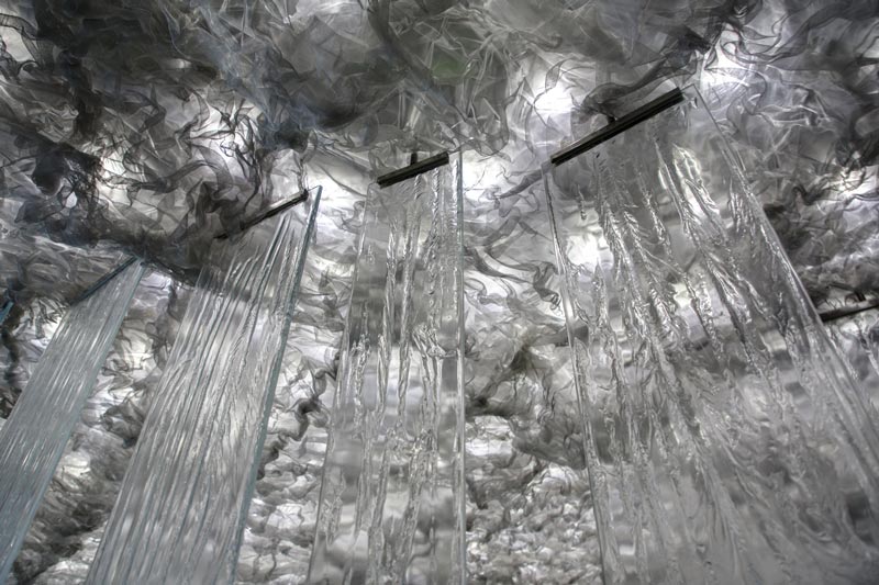 Image Source >>> Archdaily
RCR Arquitectes/Pau Llimona
#4 Think about Customisation and Personalisation
The Sintered stone, and use of the original water colour painting, was an incredible way to create a unique and different environment in this restaurant. A total one-off. It’s great to look at how you can do this in your home … and it doesn’t have to be such a big statement either.
We can get caught between wanting to choose something super personal and unique for our homes, and worrying it’s not a good investment for resale … or that we’ll tire of it … or that it will date … or that it will not appeal to others.
However, there are lots of ways you can simply personalise a space that isn’t irreversible, or permanent. One of the friends I stayed with in Denver, Kirsten Coe, who has the design company Lasso Design, had done a great job of this in their home.
My favourite was a gorgeous wall paper they’d chosen for one area of the home. It was contained enough to one space so as to not overwhelm. And it was so quirky and gorgeous, it made such a beautiful statement in the space. Add to that the small objects, wall hangings and other items that were intentionally placed in that space and elsewhere in the home – it felt incredibly personal to her and her family.
 Image Source >>> 5280.com This is the gorgeous Kirsten Coe in front of her funky wallpaper
When you think about the selections you’re making for your home, think about where you can customise something in a small way, or add a personal touch so it breathes your life and personality into your home.
Lastly #5 Think about Your Team
It was very evident how critical the team had been in bringing this vision for Enigma to reality … and to continue on delivering that experience night after night in the restaurant as it operates.
I’ve spoken about the importance of teamwork a lot on the podcast, and I’ve had guests who’ve also spoken about it loads. It’s because it works. A great team is what separates a successful and fun project from a terrible and stressful one.
Often the resistance to building a team can be purely about budget. If you bring people on board for your project, their fees take budget away from the actual renovation or build of your home … that’s how many homeowners see it. I would encourage you to see professional fees as an investment that will have a return for you … either in money saved on your project, certainty that you’ll get a great outcome for all this effort and spend, or the opportunity to save time and stress on your project overall.
Another reason I see people resist bringing on a team is that they feel they’ll have to relinquish control on their project. So many homeowners tell me they’re really excited by the idea of creating their home design, or choosing all the fixtures and finishes, or managing and coordinating things in their project. And they see if they hire a designer, that they’ll have to give that up, as the designer’s vision will overrun theirs.
Please, if this is your thinking, I encourage you to instead think about the type of designer you bring on board. Because the right designer is not someone who will make you relinquish control. The right designer is someone who will expand your vision for your home, fill the expertise gap in your experience, and actually help realise your dreams into something that is deliverable. Find someone you trust to work with in this way, and it will far exceed what you can create on your own. The same goes for how you work with a builder and anyone else you bring on your team. Teams that work collaboratively, where everyone is working to their strengths – including you as the client, funder of the project, and future owner of the finished result – they create magic, they really do.
 Image Source >>> Archdaily
RCR Arquitectes / Pau Llimona
Ok, so those 5 things to think about for your home, as inspired by the Barcelona restaurant Enigma, are:
#1 experience
#2 materials
#3 lighting
#4 customisation
#5 your team
After I attended the event at the HG Stones Showroom, I jumped on the subway towards my hotel. One of the things I love about New York is that it is always open. It was 10.30pm, and there were still queues filling up the inside of Carlos’ Bakery on the corner of 42nd and 8th street. So, I joined the queue, treated myself to a cannoli and headed back to my hotel. It was a big cannoli, and I didn’t think it possible to finish it. But clearly I underestimated my abilities, and the next thing I knew, it was all gone!
Thank you to HG Stones Showroom for hosting me that evening. Getting to hear Pau Llimona talk about this project and share his experience and learnings was sensational.
The Welcome Home Course >>> WAITLIST HERE
Eric Reinholdt’s (30X40 Design Workshop) brilliant YouTube Channel >>> 30X40 DESIGN.WORKSHOP
See the floorplan of the Anderson project (and its entry) here >>> FLOOR PLAN DESIGN
HG Stones Website >>> CLICK HERE
The post 5 Things to Consider for a Home to Feel Great | How Restaurant Design can Inspire Your Home appeared first on Undercover Architect.
