How did this family choose a preferred design option for their New Zealand new home?
Read on for the latest update in their Project Diary (and catch the previous installment here).
In our last update (and first in this Project Diary), I shared what the Andersons were asking for in their home. And I took you through the various options I created in response to their brief.
So, which option did they choose?
Well, it was a tweaked version of one of them. Keep reading!
One of the things I love about working remotely with homeowners, is the different ways I find clients use to convey their thoughts and feedback to me.
The Andersons are really invested, involved clients. And having done this a couple of times before, they’re also very clear on what they want, and trusting of the design process as well.
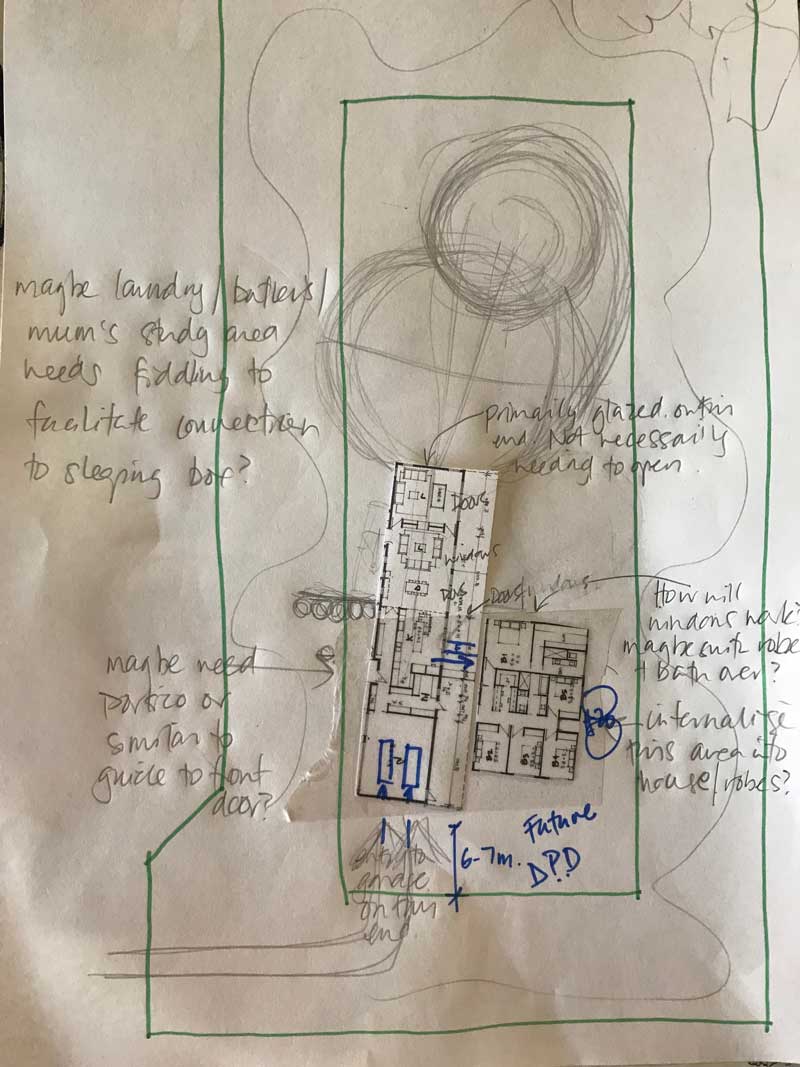
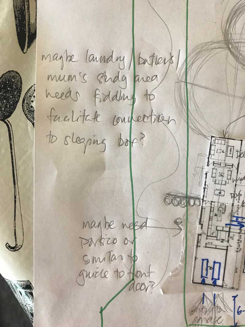
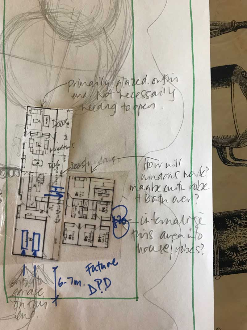
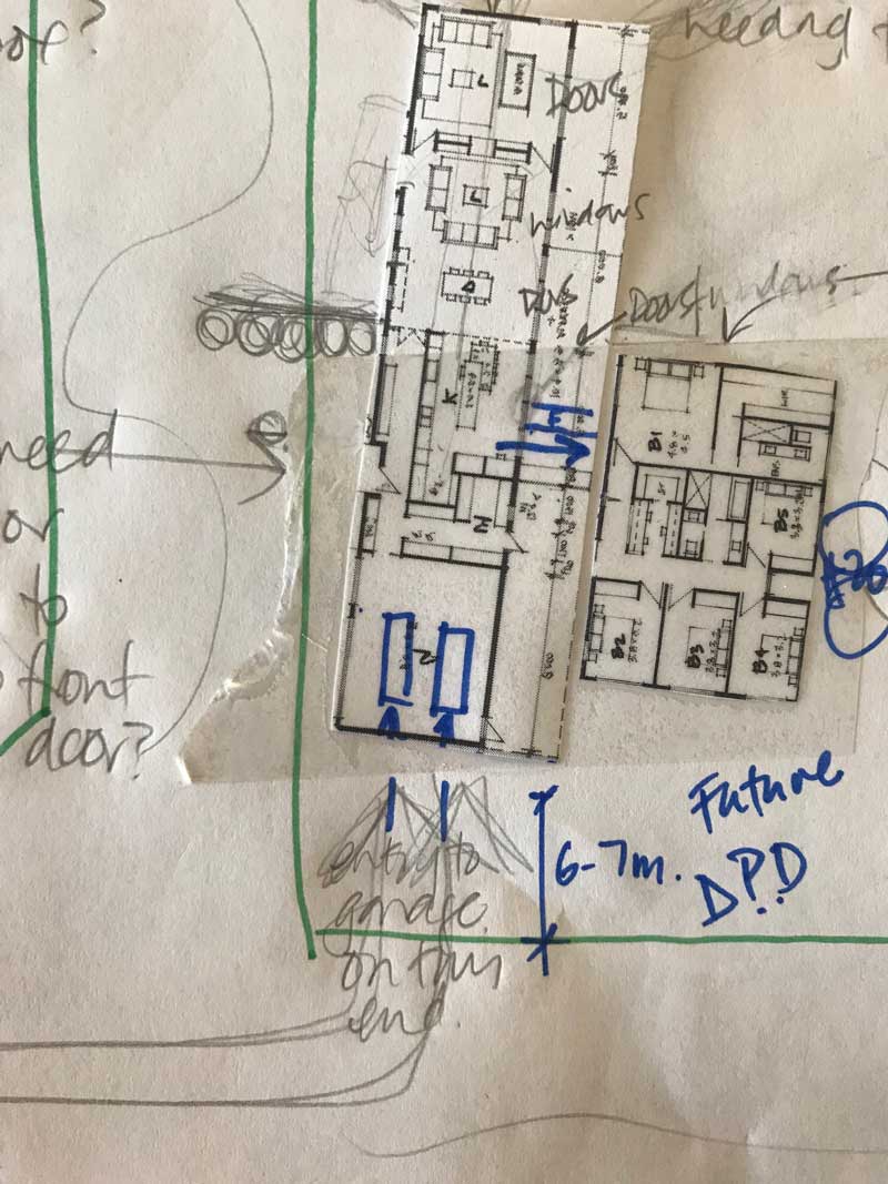
And they’re able to use different techniques to convey what they want and need, without over-riding the design process completely. Clare sent these sketches back to me, as well as an email with feedback.
This is worth remembering … When you’re using a designer, it’s important that (as a client) you feel you can drive the process, without limiting the design exploration or outcome. The whole point of using a designer is to tap into that expertise and expand what is possible. If you want to control the outcome, you may as well design it yourself and save your fees. However, if you wish to drive the process, then being clear on these three things will be essential:
+ your brief
+ your budget
+ your feedback (likes, dislikes, wants, aspirations)
And then listen.
If you’ve done your homework in finding a designer who is experienced, and the right fit for your project, then listen to their input and trust their expertise. (Want to know how to find the right designer for you? This will help.)
The feedback
Clare provided me with these images initially, which showed a slight rearrangement of the pavilions. This would assist with privatising the sleeping pavilion, and giving the living pavilion north / north-eastern orientation.
We both agreed, that siting-wise, we wanted to bring the home back to the southern end. This would limit the extent of driveway required, and maximise the northern outdoor / site area for a huge garden and privatised outlook.
Other detailed feedback included:
- Siting and garaging location would mean the home’s entry would probably need to be articulated – so guests knew where the front door was
- The arrangement of the master needed to consider the new siting and outlook, and how windows and light worked with the bed position – and the ensuite needed to work into this as well
- The service zone of butler’s pantry, laundry and study nook, needed resolution as part of being the connection zone between the living and the sleeping pavilions
- And some other feedback about elevations, and the general stepping of the floor plan, plus where covered outdoor areas might be located for sitting, and for hanging clothes
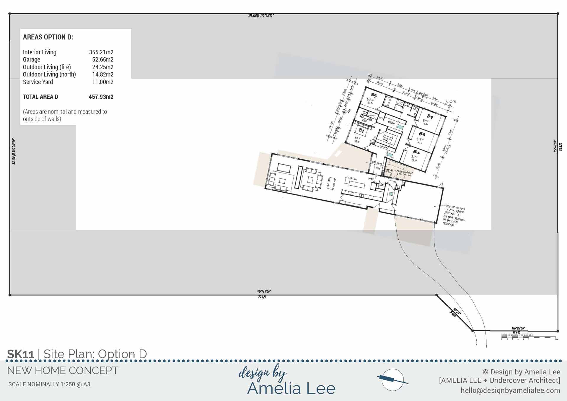
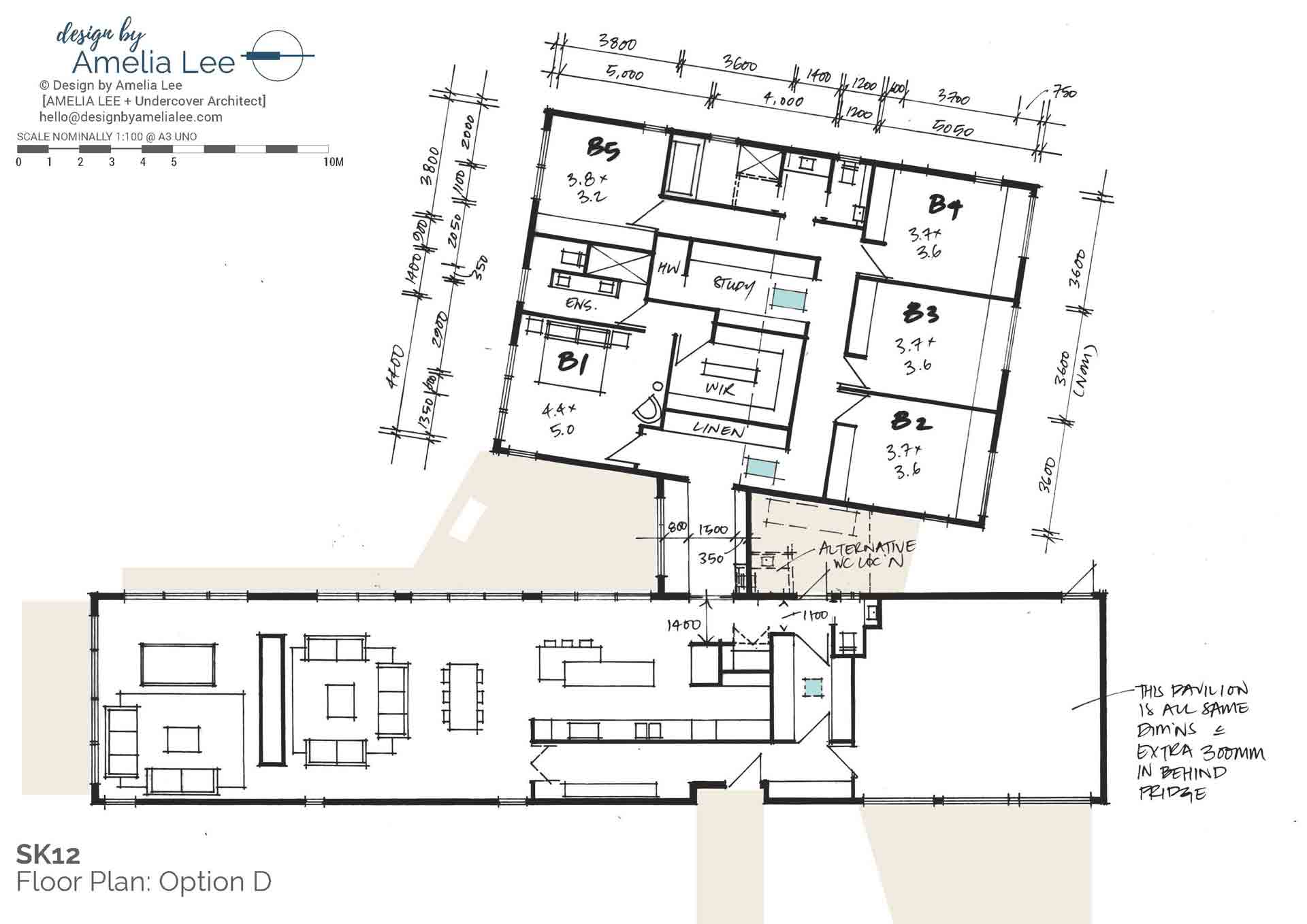
So based on the feedback, plus on reviewing some images that Clare had sent to me to explain some of these ideas, I created a new option: Option D.
Here is the next design option for this New Zealand home …
The siting of the home brought it back towards the southern boundary. This minimised the length of driveway required into the property – and driveways can be expensive! So, keeping it shorter helps us put budget elsewhere. It also maximised the northern part of the property for landscaped area.
The cul de sac location ensures the home can then have privacy in this way. The finger-like nature of the living pavilion is exposed for natural light all day (to both living areas) and the sleeping pavilion also gets good natural light (and is protected from harsh afternoon light as well).
Entry into the home occurs at a core area of services, and the home itself is screened at the entry point. This helps provide an airlock at colder times of the year as well. In this service core is the mudroom, laundry, toilet, butler’s pantry and study nook, and then the home expands into living and dining areas.
Two living areas are separated by a storage / fireplace wall that could service both rooms. The detailing of this wall was also intended to provide transparency around this wall (but still have acoustic separation between the spaces), so that views are maintained throughout. Watch out for the next instalment to see how that was achieved.
A service core also exists in the sleeping pavilion, housing linen, walk-in-robe and study, and skylights provide natural light at these points.
Kids’ bedrooms are equally sized (no arguments), and the master and guest bedroom face north. These make them great retreat spaces as well for their users.
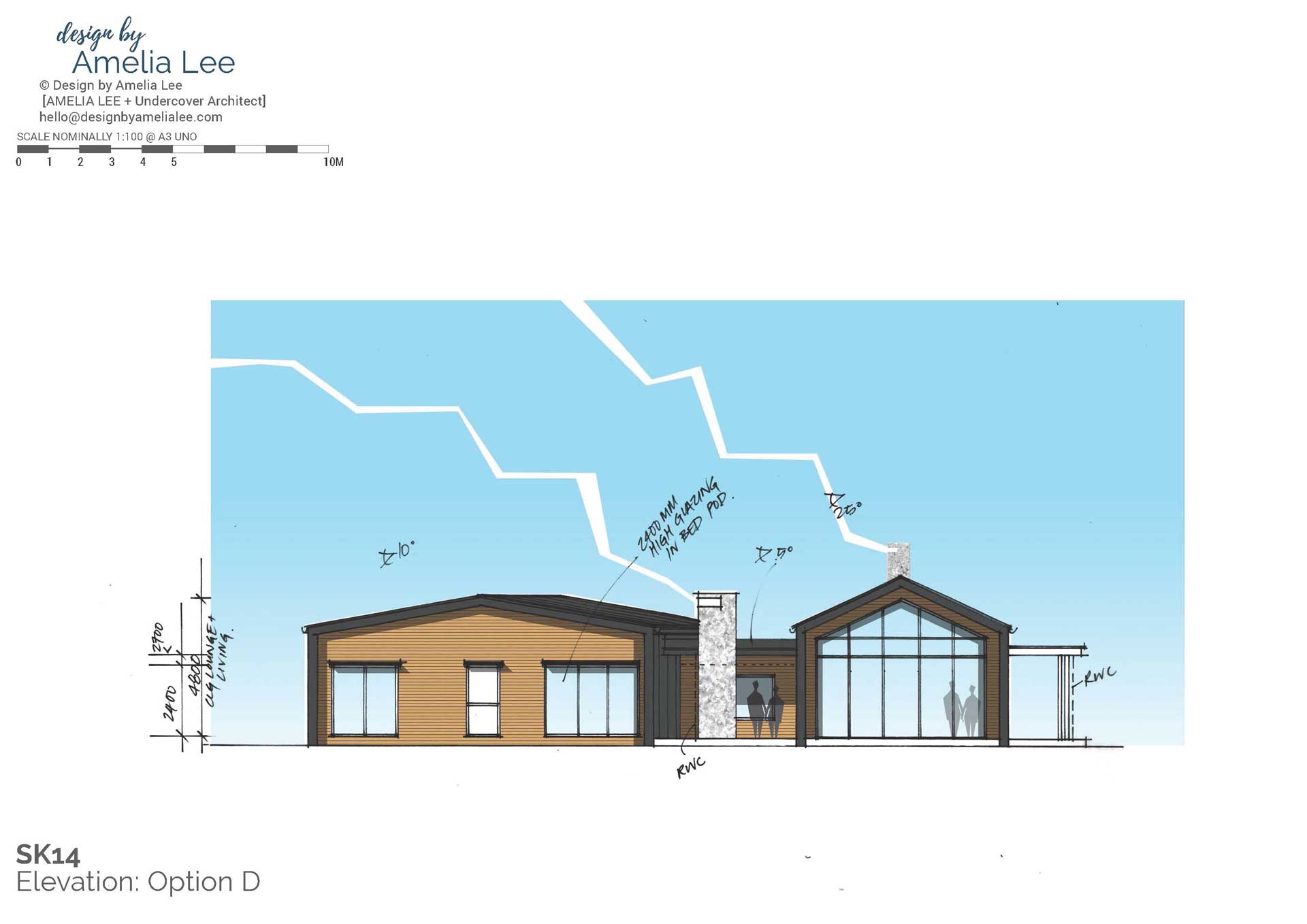
Option D: Northern elevation of the home, showing full glazed façade to the north-facing living space
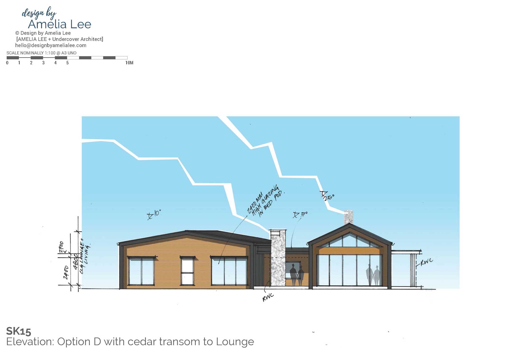
Option D: Alternate northern elevation, where cedar is introduced to the living façade as a transom between glazing panels
Now that we had the plan option moving closer to resolution, it was time to show the Andersons what I had in my head for the elevations. Clare and I had been sharing imagery and ideas along the way, and we both had very clear ideas about strong simple forms, with the living pavilion being the dominant structure.
Both the living and sleeping pavilions are expressed as simple gabled forms. Because the sleeping pavilion is a wider shape, the pitch of the roof is kept lower, to help it not dominate overall. The living pavilion has a steeper roof, and open glazed end on the north. Connecting the two pavilions is the library spine. This provides an outdoor area to the north, and a service court to the south, all tucked between the two pavilions.
I started playing with how the glazed façade could be broken up – and the second option explores an alternate idea.
What happens next?
Now things are getting exciting, as we’re honing in on the final option. Again, the Andersons are super fast at getting feedback to me, and me then being able to resolve their design as a result. Stay tuned for the next instalment, as I share the final design and elevations. I’ll also share the package of drawings I prepared to illustrate how the inside would appear, and you’ll get to see a site update (because things are moving along there too!)
Until next time …
THIS MAY ALSO INTEREST YOU …
Listen to the podcast where I introduced this New Zealand project for the first time here.
Want to see how the Andersons created their Brisbane home? Start the Project Diary here.
Do you love following progress of a home? There’s also the renovation of a Queenslander cottage here.
The post Choosing a preferred design option | New Zealand Home Project Diary Update #2 appeared first on Undercover Architect.
