Renovating an Art Deco Queenslander into a contemporary family home can be challenging.
It can be difficult to preserve the character and original details, whilst ensuring the finished home suits modern family life.
Read on to see how we achieved this in this renovation project.
This project was my husband’s and my own renovation. It was the third we did together, and by far the biggest!
We purchased it as a project (ie we intended to renovate and sell once complete). It look longer than expected, because around the time of purchasing it, we also had our third child, and I started an architectural practice with 5 business partners!!
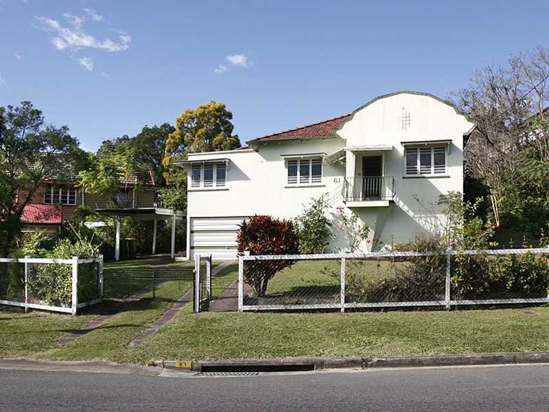
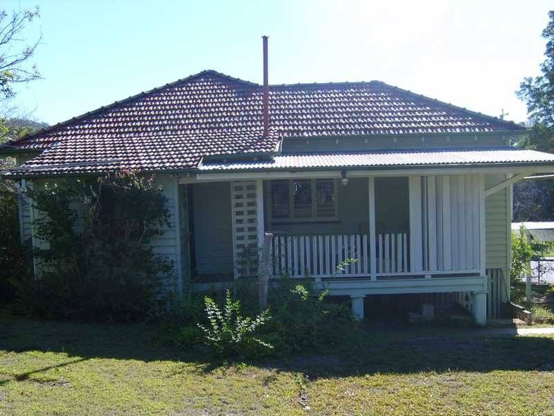
This home was around 100m2 at its original size. A small 3 bedroom home, it had walk-through rooms as verandah space on the original home had been built in to contain a bathroom and study / nursery. A new kitchen had been put in by the previous owners prior to renting it out, and there was a small laundry tacked onto the back, which sat adjacent to a deck. The deck was accessed by a single back door, and had no relationship to the interior.
We renovated it over a three year period into a large and beautiful family home intended for sale on completion.
Built in the 1930s, the home had significant original features both internally and externally that we sought to protect and enhance. It was quite an unusual Queenslander for the area, being Art Deco in style. We wanted to preserve this character, and the local town plan also required that the street elevation be protected, and any other pre-1946 features of the home.
Room sizes weren’t conducive to modern lifestyle requirements, and did not optimise the orientation of the site (which was north to the side). And despite the block actually being a large one for its area, it was a weird pizza-slice shape, and the home was doing very little to create an indoor / outdoor connection with the garden around it.
During purchase, and our settlement date, I worked on several design options. However, when we went for our pre-settlement inspection, we discovered the neighbour had come onto the property (taking advantage of the fact no one was occupying the home), and chopped down a line of significant trees along the fenceline. They sat on our property, and their foliage had screened the neighbour’s upper floor deck (their main entertaining area) from looking down into our yard. The neighbour had done it to open their views and northern light up, and illegal as it had been, you can’t really do much about trees that are no longer there. We did reach a financial agreement with them, but it meant that I had to completely rethink the design in order to create privacy from their overlooking.
The design ideas
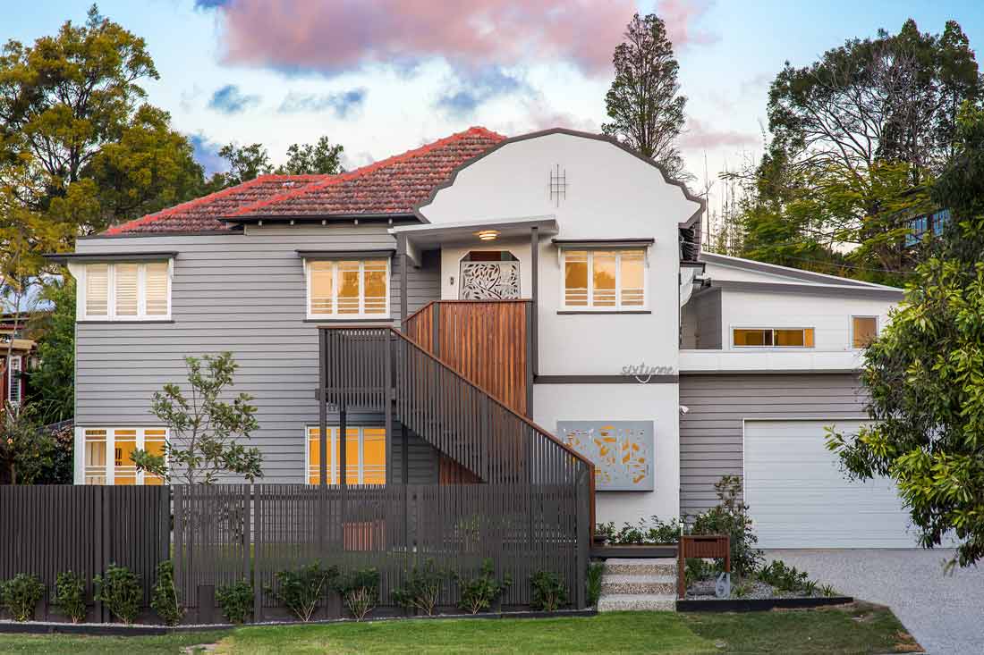
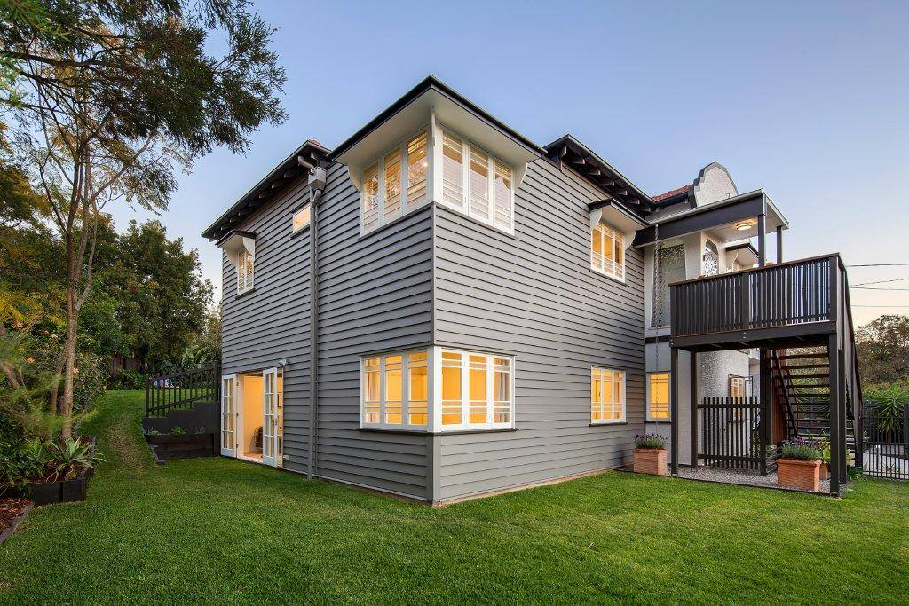
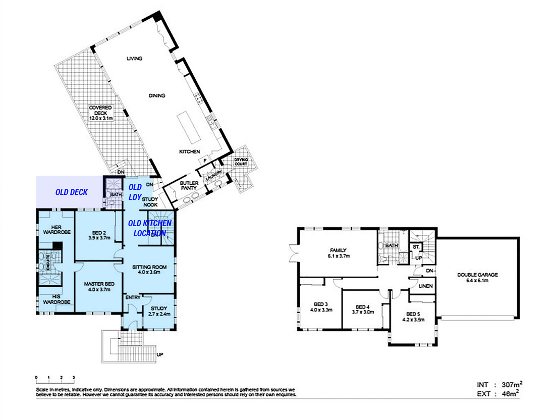
So, the design we ended up deciding on raised the existing home by around 1100mm, and shifted it sideways on the block by 1500mm (to the east and away from this neighbour). This then created sufficient room on the western side to add a double-car garage.
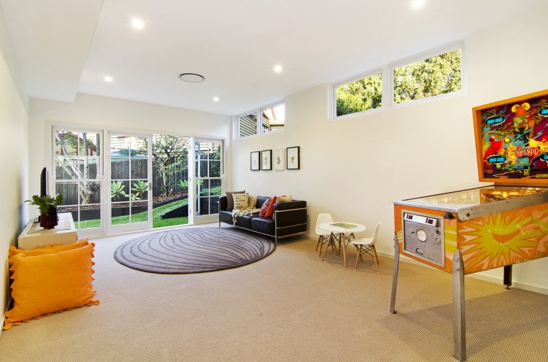
We located secondary bedrooms and a family room (or kids’ living space) on the lower floor, with their own bathroom and internal entry from the garage. This living space had french doors that opened onto the side garden. We securitised the front garden with high fencing so it connected to the rear garden as well. This meant that kids could be in the lower living area, run around the garden, come up into the rear garden and main living area, and be safe and contained in the one space.
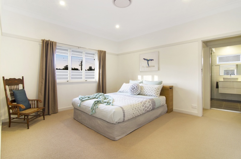
In renovating the existing home, I was very keen to keep as many of the original features as I could. This included traditional ceilings, and timber detailing on the walls. So, the design in the existing home worked to keep the walls where they were, and we located the master bedroom with an ensuite, and his and hers’ separate walk-in-robes, in this part of the house. We also located a second bedroom, sitting room and study in the original home as well.
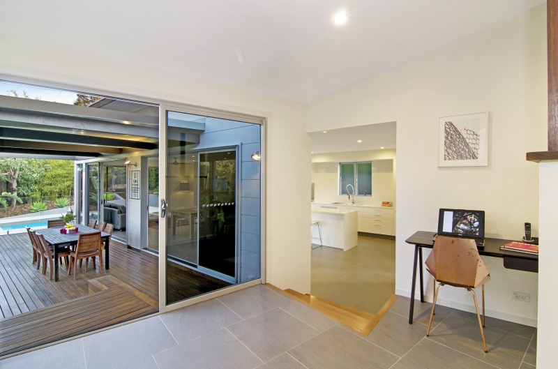
The old deck was removed, and the old laundry became a connection zone between the existing home and its new extension. We located a stair in the old kitchen to connect lower and upper floors. A study nook was created in the connection zone, and a full bathroom added on here, which could be accessed as a guest powder room, and also for showers from the pool area.
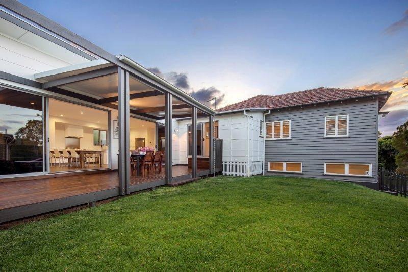
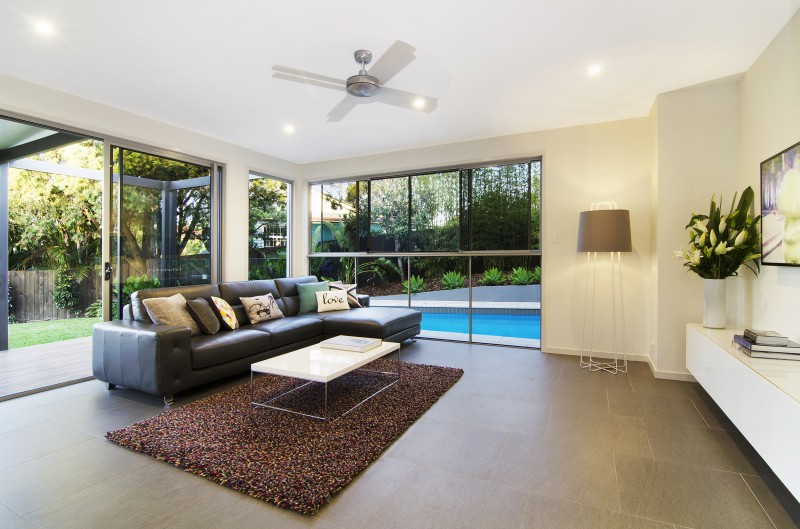
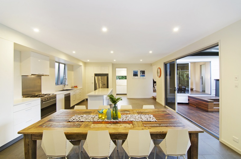
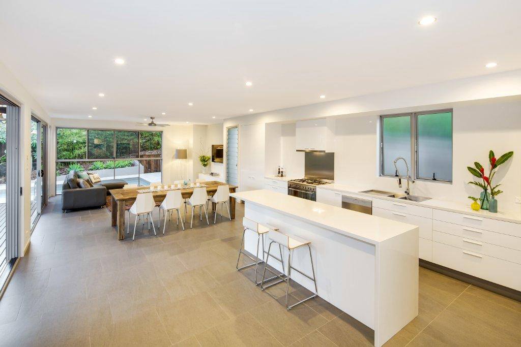
The biggest change to this home was the pavilion extension we added to the rear. I positioned this along the southern boundary of the home. It was designed as a separate element that ‘bolted-on’ to the connection zone. Due to this design, we could position the pavilion to do a few things:
- the main living areas were able to be oriented to the north
- it enabled the home to connect with the rear garden
- it privatised our garden area from the overlooking neighbour
- it stretched out budget as we could then build the pavilion as a new structure and more cost-effectively (renovating can be labour-intensive and slow – a pavilion extension can be much faster and simpler to build, capitalising on new-build efficiencies).
- it meant our living / kitchen / dining space could be sized as generous, open plan spaces, and not constrained by existing house structure
- we were free to choose suitable materials because it was an independent structure to the home
This extension successfully expanded the home to suit modern lifestyles and enable full surveillance and connection of indoor and outdoor living areas, as well as the pool.
The result was a home to suit any family, at any age, throughout their ages and time in the home. It also gave this gorgeous old Art Deco Queenslander the opportunity to live on!
Some special design features we included that you may find interesting:
The intercom / security door
We wanted to create an intercom gate, so the front door could be left open to bring breezes through the home, yet the home stay secure and private. We also knew that the front door is a bit of a walk from the lower floor, and the rear living areas.
A local aluminium panel fabricator had a range of standard panel designs that included this ‘leaf’ patter. The home itself was located on the grounds of the original orchard of the first home in the suburb – so I loved this motif of leaves / trees / orchards as a decorative element. We had the frame of the door custom made from square aluminium tube, and the panel sized to suit, to fix over the top.
We then fixed a handle and lock, and also included a camera intercom connected to a unit in the kitchen. It didn’t electronically open the door, but it meant you could determine from the kitchen if you needed to walk to the front door!
We also used this aluminium panel design as a privacy screen on the lower floor bedroom, where you start walking up the stairs.
The lettering for the ‘sixty-one’ street number fixed to the house, and the letterbox numbering as well (structurally supporting the timber letterbox) were all custom made to my design, and powdercoated to match the screen panels.
The colour scheme
We wanted to keep the colour scheme fairly monochromatic so as to appeal to future buyers, and give the home a contemporary look. However we were keen to use colour to accentuate the original features of the home. This included the stucco art deco form on the central part of the house, and its feature border, which we highlighted in a darker paint colour. Colours used here are all Dulux:
- The dark grey is “Bushland Grey”
- The white is on the window frames is “Whisper White”
- The lighter colour on the stucco and new extension is “Grey Pebble”
- The dark / black on fencing and trim is “Namadji” (this is a brilliant warm black)
- Natural timber battening is Spotted Gum with a natural oil finish
Rainwater chains
The new little roof to the entry needed to be unobtrusive and elegant, and so a downpipe wasn’t going to be a great feature right by the entryway. Instead, I sourced a rainwater chain for that small area of roof, to run down to a stormwater drain mounted in the grass garden below. The same detail was used on the roof to the outdoor room at the rear. That roof was actually made from Solarspan Bondor, which is super-fast to install, thin in profile, and provides insulation and weather protection all in one material.
There were lots more, as a lot of thought, detail and attention went into this home to make it extra special! Have a look through the photos and floor plan below. All images and design are copyrighted to Amelia Lee, Undercover Architect


Want to see more Queenslander Renovations? Check out these other blog posts:
Before and After: Bringing a Dilapidated Workers Cottage into its new future
The corner store no more | Renovating a corner Queenslander home
The post An Art Deco Queenslander becomes a Contemporary Family Home appeared first on Undercover Architect.