You’re tight on budget, but want maximum functionality. So how can you fix the floor plan of a $250,000 home?
Working with a volume builder – one who builds hundreds of homes each year – is a great way to build affordably. And it doesn’t mean you have to sacrifice design. These homeowners wanted to maximise the functionality of their floor plan.
In this Spotlight, Amelia worked with these homeowners to improve the design they had, and see how to create an affordable and fantastically functional, family home.
The homeowners and their land
A couple with 2 young kids were planning their future home. They want to build in regional Victoria. For a few months, they’d worked with the building company and their draftsperson. They had a design that met their budget, but they weren’t sure it was the best fit for their lifestyle.
The site is a wedge shape, with a fixed location for the driveway and garage, and it is 778m2 in size. There’s large easements along the two boundaries, and parkland adjacent. The parkland provides a great outlook (and is to the north) – and no neighbouring home!
They thought that the home could have a better use of space, especially in kitchen and dining areas. In their words “We were out of ideas!”
They even tested the design by using little cutouts of their furniture (drawn at the same scale as the plan). This had immediately shown them how challenging some of the spaces would be to use long-term.
Image may be NSFW.
Clik here to view.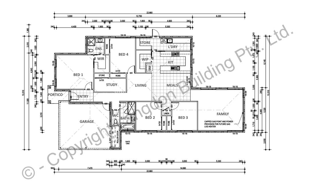 This is the proposed design, prior to their Fix Your Floor Plan service
The Brief
They would like to create a house that:
- is a functional family home
- sees their 2 kids (aged 4 and 2) through school
- meets their budget
- makes the most of what’s possible for their wedge-shaped block of land, with capacity to add on later
Their wants for the house are:
- 4 bedrooms
- 2 living areas
- car accommodation
- functional kitchen
- ability for living areas to be separately used as ‘kid’ space and ‘adult’ space
- separate study close to living area, that will fit an existing desk they own
- good storage
- indoor / outdoor connection (covered outdoor area isn’t essential at this stage, but space for it would be good)
- windows positioned to take advantage of aspect and views
- garage is required to be positioned on south-east corner due to existing driveway crossover
The Budget
Maximum budget is $250,000.
They need to stick to their budget and accept that it may mean that they won’t have all they would want in a home.
Yet they need to be happy with the compromises they have to make to meet budget. And of course, they want it to be as functional and as well-suited to them as possible.
Main Observations about the Proposed Design
A lot is being squeezed in, to the detriment of the design
It feels like the designer has taken a list of rooms and tried to get them to fit into a floor plan of a certain maximum area. This would be to meet the budget. They don’t seem to have (or helped make) value-judgements to determine whether it all can fit, or what areas to prioritise.
The solution may involve choosing certain areas over other. This means thinking about how to live day-to-day in the home … not ‘just incase’ living.
It seems that priorities are given to areas used seldom, over areas used always
As well as a lot being squeezed in, the design has areas (such as the walk-in-pantry, laundry, storage and Bed 4) that are oversized.
This is whilst areas, such as the 2nd living space and meals, are being dramatically compromised. Bathrooms are super tight in size also – again, probably because of budget choices.
The design turns its back to the west, but divorces itself from the garden as a result
The site is great – generous in size, with a fantastic outlook to the NE and North.
In a desire to protect the interior from western sun, the home disconnects from a big part of the garden. This will make it difficult to supervise kids playing in that part of the garden from within the home.
The kitchen is a challenging arrangement for a family
U-shaped kitchens, in my experience, are challenging for families. They end up being bottle-necks, as little kids come in and get underfoot. You also end up with corners which are hard to use, and with benchspace that ends up with clutter pushed into it. Doors / drawers banging into each other as they open at right-angles to each other.
The circulation around certain rooms will compromise their functionality and privacy
Bed 4 is directly off the living space. Circulation from the laundry into the home, coming through kitchen, between the kitchen and WIP, will make for busy passageways in busy areas. Circulation is compromising privacy and functionality, and once spaces are furnished, some movement will be a tight squeeze.
Some Main Design Aims
When I started preparing the design concept, I had these aims …
- The design of the home has a lot in the ‘guts’ of it. By this, I’m referring to the internal part of the plan that is away from the edge. It’s away from windows providing natural light and ventilation. The priority is to get the habitable rooms to the edge, and keep areas like storage in the centre.
- Given it’s a single storey home, skylights are an option to light these internal areas. These can be economic options such as Solatube skylights. Or something more like a Velux sky window.
- The key to creating spaciousness in a compact home is getting clear lines of sight through it. The hallway can enable this, as it will direct people’s view through the home, and to outside. This expands the size of the home as the view takes in the garden and views around it. Keeping the hallway clear and straight will assist with maximising views.
- And given the budget (and that the existing design meets it), any work can’t move the external walls. This is about reconfiguring the interior planning for a better outcome.
The alternative design options
I prepared two alternative designs. Imagine the home as two halves, divided down the hallway. There are two design options for the master bedroom side, and two options for the kids’ bedroom side. These can interchange (mix n match, if you like!) – so there’s 4 options in total. Click to enlarge the floor plans.
Image may be NSFW.
Clik here to view.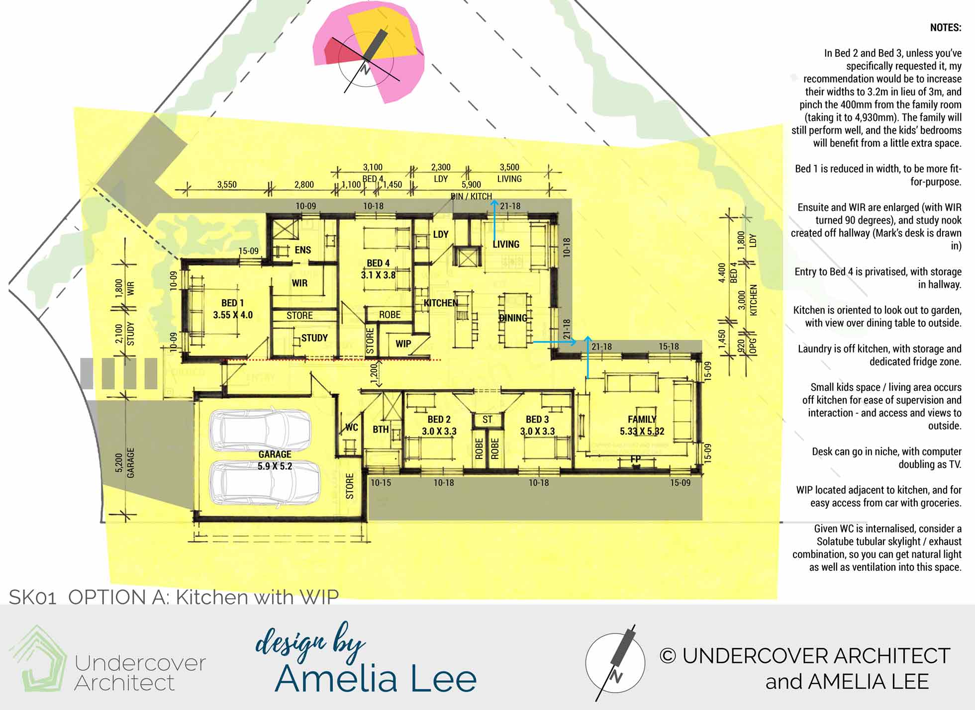
Option A moves the kitchen over. It also provides a living space to the northern corner, with views out to the garden. The kitchen has a walk-in-pantry. Space is arranged to give more to the areas that will be used frequently (and hence matter more). Kids’ bedrooms are made slightly larger. The family bathroom stays in its proposed location. It has a minor rejig.
Image may be NSFW.
Clik here to view.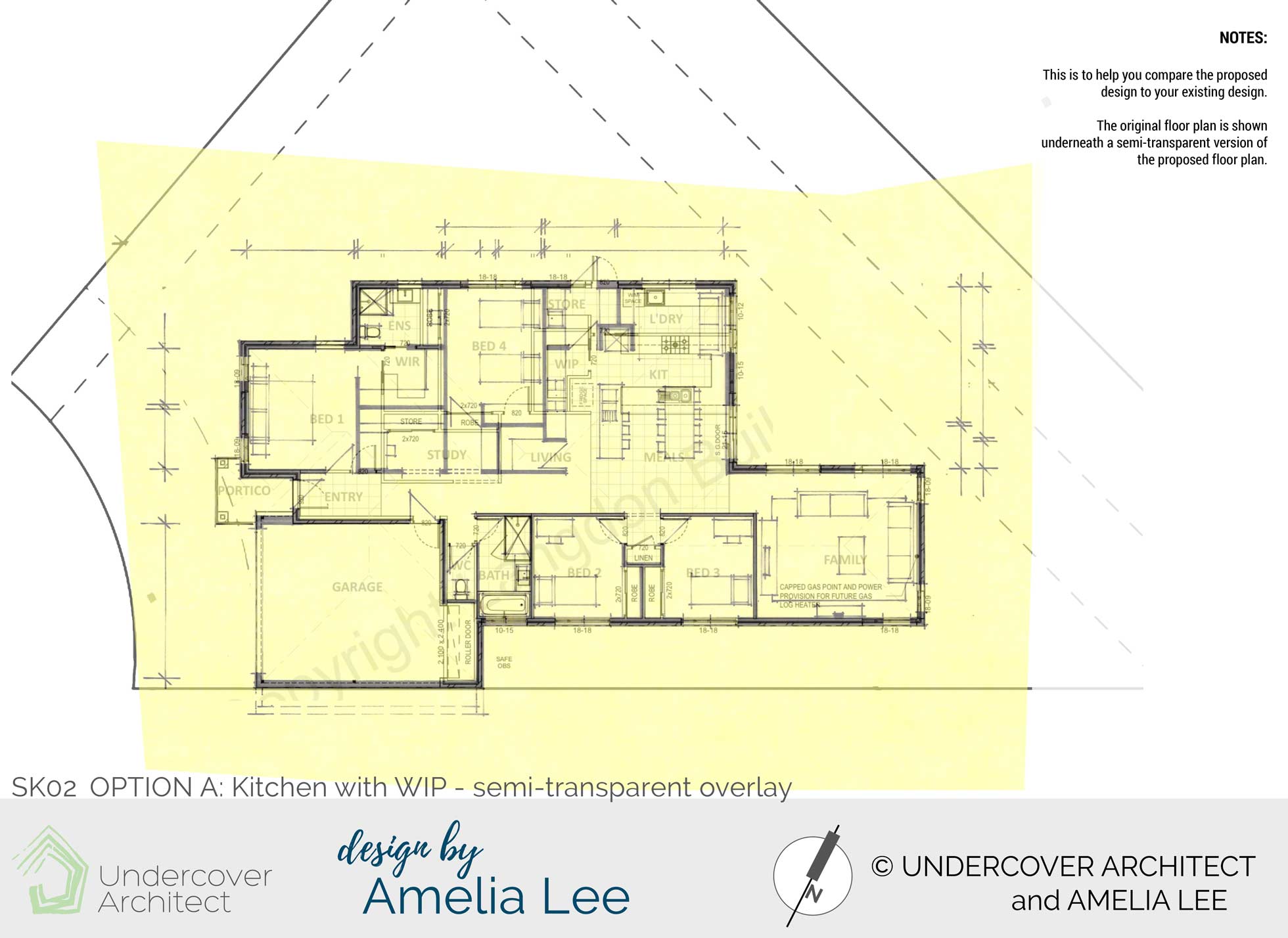
I provide a semi-transparent overlay so you can compare the two floor plans. The alternative design has not increased the size of the home at all.
Image may be NSFW.
Clik here to view.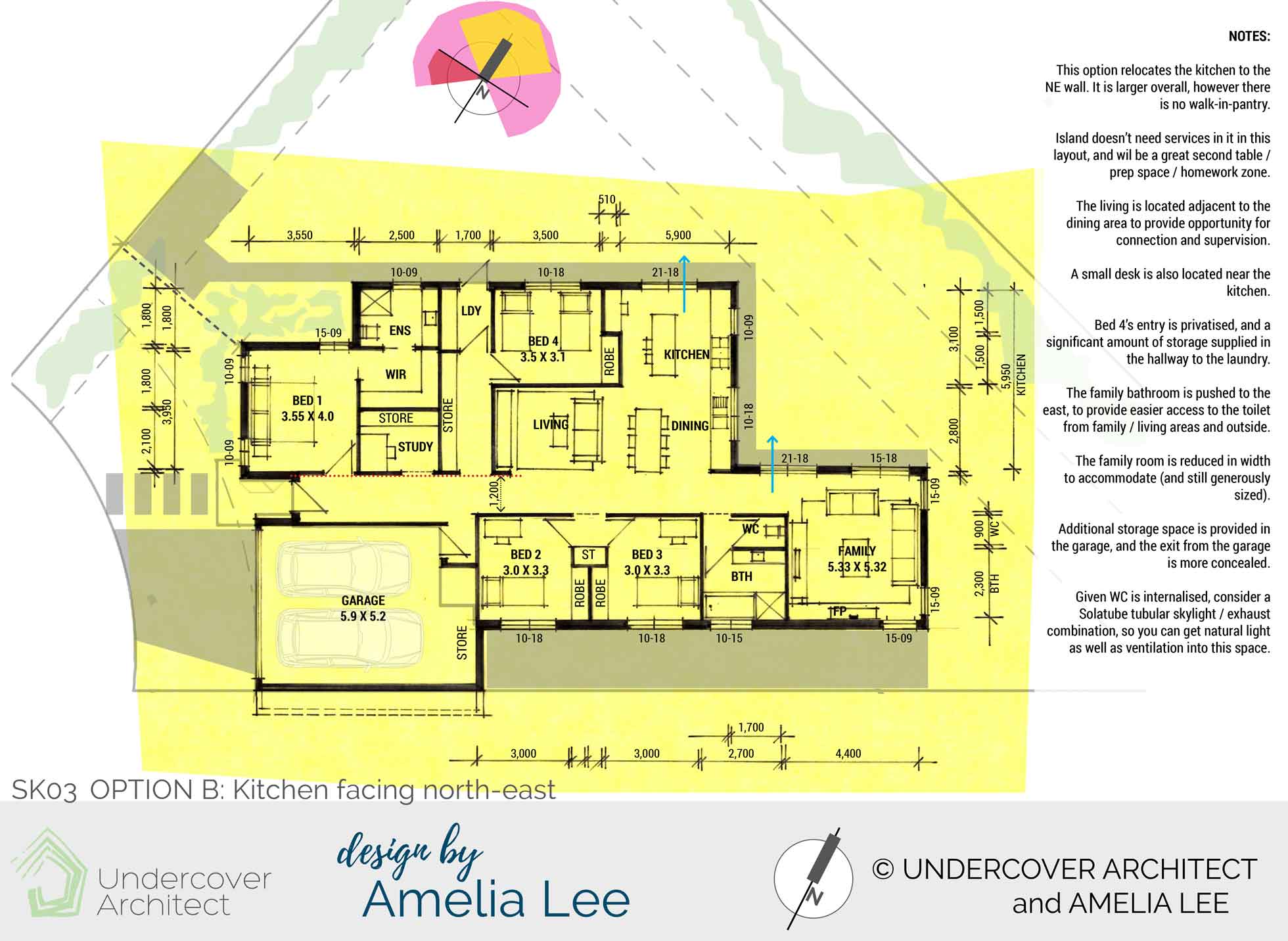
Option B prioritises the kitchen as a hub for the home, and enlarges it. It runs along the rear wall of the home and providing direct access out the side of the home. It includes a study nook. The living space (or kids’ zone) is compact. It’s designed so no doors run off it, enabling it to be well-furnished and functional. It borrows light from the open plan kitchen / dining next to it.
The family bathroom and powder room move down to the northern end of the bedrooms. This gives more storage space to the garage.
Image may be NSFW.
Clik here to view.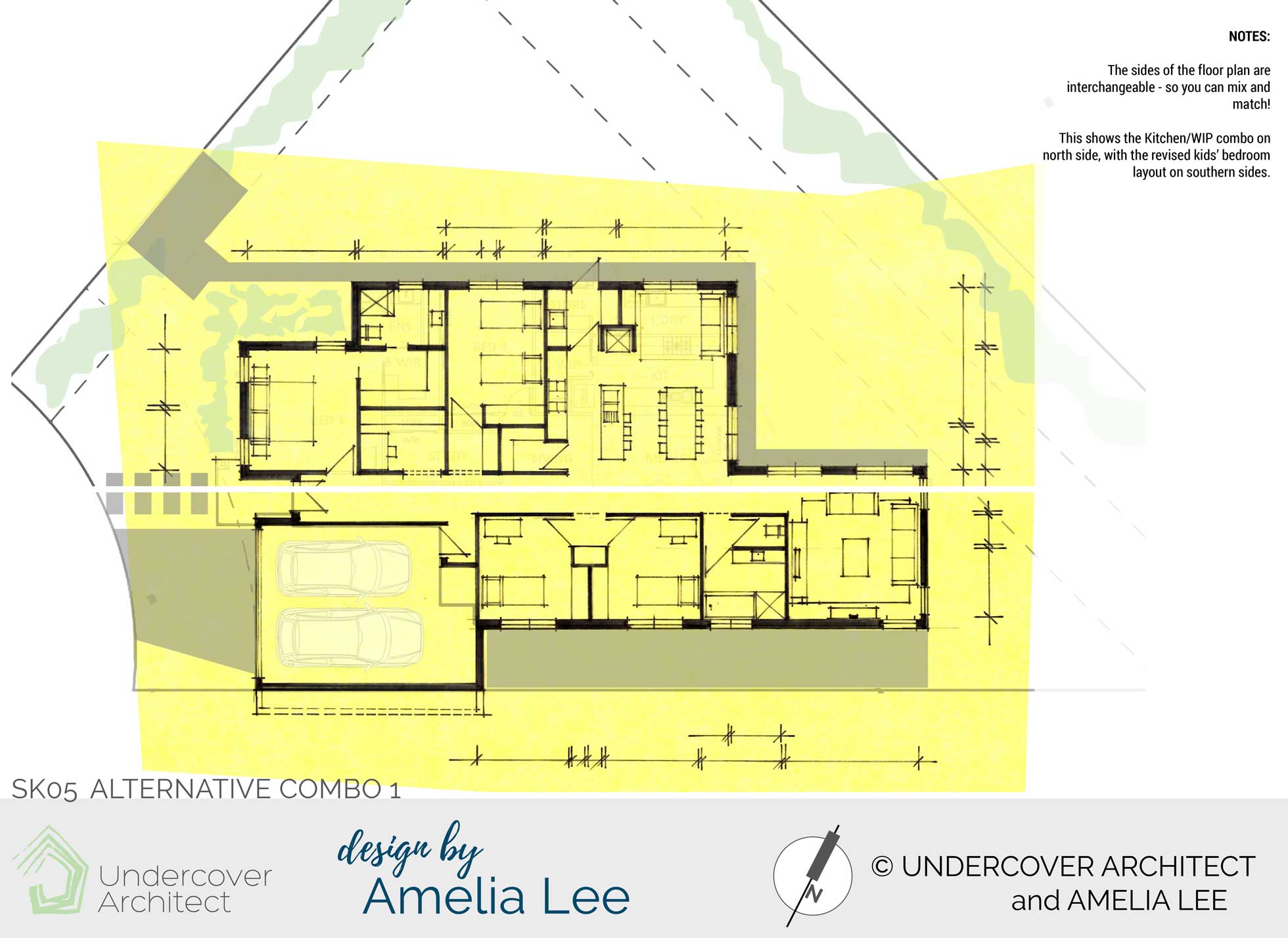
This option shows a mix-and-match of Option A and B.
Image may be NSFW.
Clik here to view.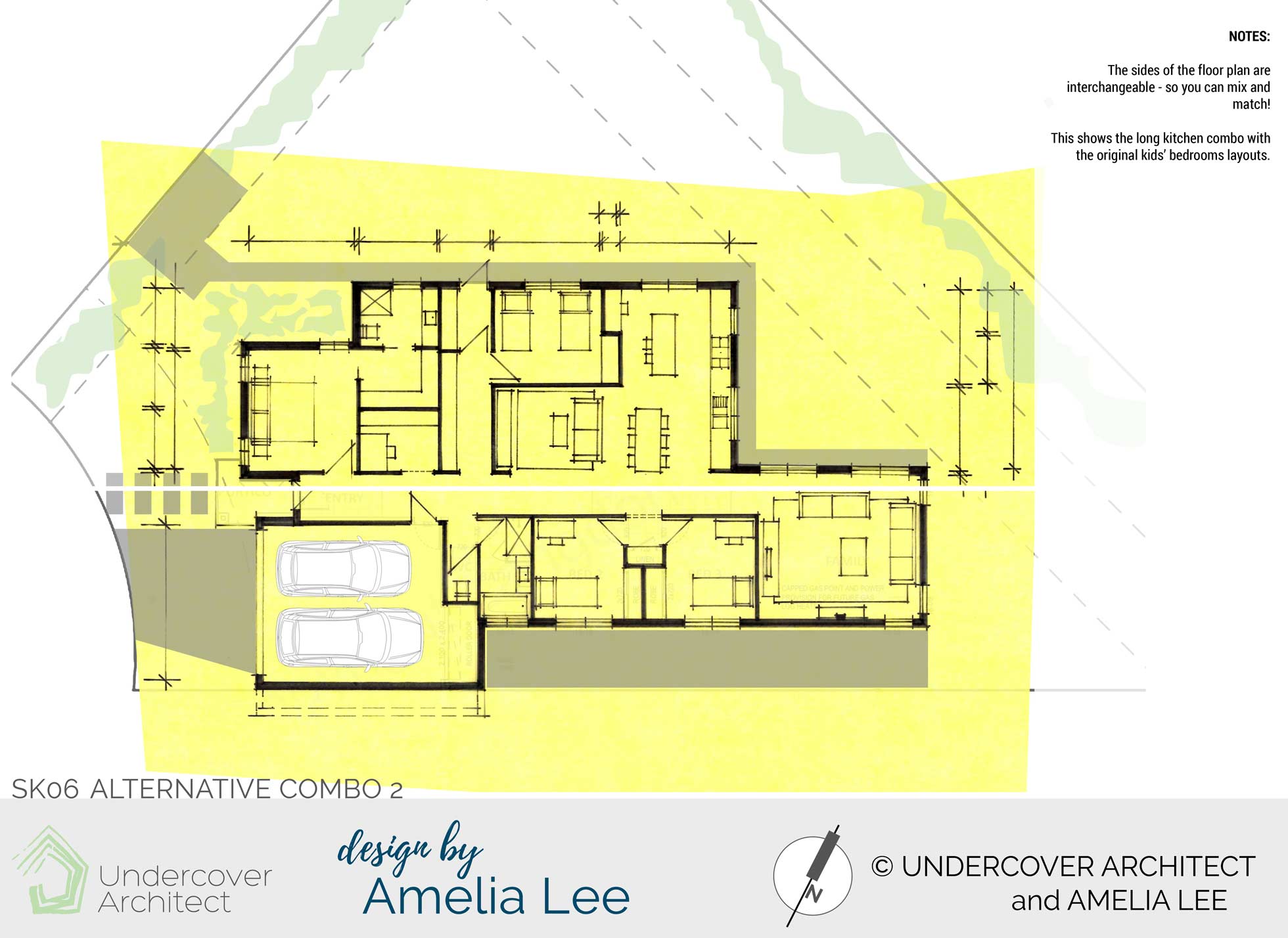
This shows another combination option for the floor plan.
The Verdict?
The clients’ favourite option was …
“We have chosen the long kitchen combo with original kids bedroom layout. (Combo 2) We like the extra room this provides us in the living area plus the long storage area (and privacy to bedroom 4. Excellent). Although we do like the new main bathroom / toilet layout and the revised garage access, we decided to prioritise a little more space in the family room.”
They had this to say about working with Amelia / me. (Amelia on UA, me on DbyAL)
“From our first contact to Amelia, right through the design process and beyond, we found Amelia to be supportive, understanding of our situation and very professional.
The Fix Your Floor Plan service was the best investment we made when planning our house. We were on a budget and had a small footprint to work on, yet Amelia found answers to those challenges. The ideas and options Amelia presented enhanced our floor plan and met our needs as a growing family.
We would highly recommend having a Fix Your Floor Plan done by Amelia as the benefits to your way of living last beyond the paper stage.”
The post Fixing the floor plan of a $250,000 home appeared first on Undercover Architect.