What happens when you love the location, but not necessarily the look of your coastal home? Can you breathe new style into a 1990s, dated home?
Certain home styles have a strong aesthetic style of their time. And for some homeowners, this can feel dated and not to their liking. These owners felt this way about their 1990s, Henley home.
In this Spotlight, Amelia worked with these homeowners to find effective ways to introduce a Hamptons Plantation style (think India Hicks) into this home. It had some great features, fantastic orientation, but wasn’t optimising this for their lifestyle.
The existing home
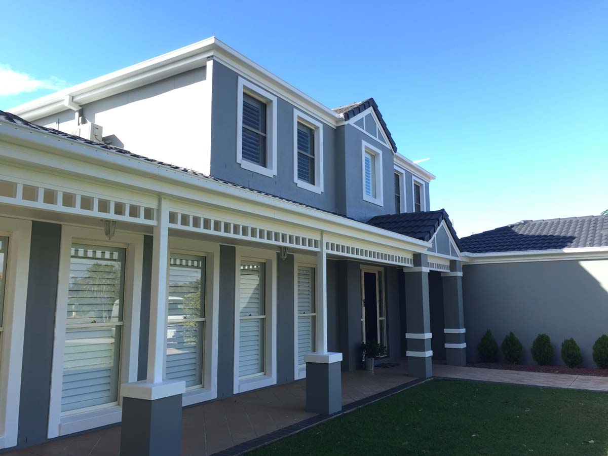
This 1990s Henley home is generally in great condition. The owners bought it from the original owner that built it. It’s on an odd-shaped block that gets wider to the rear, and faces north-east – a fantastic orientation.
The home is in a coastal location, and yet does not make the most of its site or the aesthetic opportunity to make it feel lighter, brighter and more coastal. Particularly a Hamptons / Plantation style.
The homeowners, since purchasing it, have done some work internally in the form of new robes, lighting, fans, plantation shutters and air-conditioning. They’ve also installed a free-standing shed on the side of the property, worked on the garden, painted the exterior, and painted fences.
The new dark grey colour scheme with white trim is a vast improvement on the peach / beige of the original home. It presents well to the street, with clear access into the home.
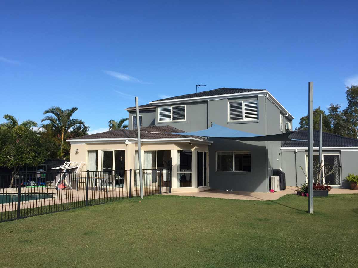
The rear of the home goes some way to opening up to the outdoor entertaining area, pool and garden. However, there’s limited covered outdoor entertaining area, and shade for the warmer months. The lower floor protrusion shows the original colour of the home (and also the homeowners’ target for future renovation work to create a better indoor / outdoor connection).
The homeowners
The homeowners have renovated before, and plan to do the work themselves on this home. Both are busy professionals, with one owning a business managing property repairs and maintenance. They have professional carpentry experience and an artistic eye. And they feel like they’ve been working on houses for a decade!!
They have one child about to enter teen years. The home is large for the 3 of them, and so this is also about exploring opportunities to create self-contained accommodation they can rent out. Entertaining at home is important, and outdoor entertaining that makes the most of their coastal location, the gorgeous weather and their garden (which they love spending time in).
The Brief
They would like to create a house that:
- Is a functional, beautiful home that works with their lifestyle
- Is welcoming, spacious and modern with good flow between areas
- Takes advantage of the block of land
- Maximises the privacy and quietness of the block
Their wants for the house are:
- 4 beds upstairs
- a remodeled ensuite
- a new walk-in-robe
- updated main bathroom and toilet
- a larger shower and freestanding bath in the bathroom, with a larger double vanity
- more storage
- better use of the upstairs landing area
- dedicated study space (currently a walk-through space from the garage)
- a self-contained granny flat
- updated, larger kitchen which opens out to outdoor room
- a large covered outdoor room
The Budget
$100,000 … and potentially this can be increased if the work can be staged. My advice was that this was possibly achievable if the bulk of the renovations were bolt-ons and updates, and they did the bulk of the work themselves. They have the skills and experience, so this is really a case of whether they can dedicate the time to the project (and away from their current professionals roles). And it’s also what type of finishes and fixtures they choose, and how far they want that first $100,000 to go.
Main Observations about the Existing Home and Brief
The block is facing the right direction, and is beautifully private, generous and flat
They have a fantastic spot, with a generously sized block of land that can really offer their home huge benefit … in enhancing the outlook, in keeping their home private, and in providing great indoor / outdoor connection and in filling your home with light. And let’s not forget that pool!
Currently the home is not maximising the connection with either garden – the front or the rear.
The front garden needs privatisation from the street so as to be a useful space for the home.
The rear of the home needs to open up to the rear garden more effectively, and the pool fence needs to be arranged so it doesn’t sever the backgarden from the home.
In addition, some covered outdoor space (alfresco) will provide you with great outdoor living and entertaining area in direct connection with the garden.
The home is all Henley
The home is very much in keeping with the style of Henley Homes – especially of that era.
The 45 degree walls, narrow doorways, and bulkheads/coffered ceilings are all signature Henley items.
The stepping hip roofs are also Henley signature items.
Simplifying all of these elements will bring a modern feel to the home immediately. This home has so much great potential to be a stunning, contemporary home!
The home is generously sized, but doesn’t feel as spacious as it could
It’s a big home. Yet some rooms are compactly sized. Circulation is convoluted. Clear lines of sight aren’t really possible, as walls and openings zig-zag or change in width.
This is particularly evident at the front door – looking through the narrow passageway into the rear of the home, there is no opportunity to really connect visually with the incredible outdoor area beyond.
Opening up clear lines of sight through the home will make such a significant difference to how it feels and operates. Making sure that movement is oriented by light and views will create a feeling of calm and wow.
Some Main Design Aims
When I started preparing the design concept, I had these aims …
- Work within existing structure when reconfiguring spaces to make new work simple and cost effective
- Provide opportunities for them to add their aesthetic to the home in large statements that impact how the home really looks
- Orient the floor plan to make the most of the connection to the garden, and direct all views to the garden and outdoors
- Create spaces for all three family members that will serve their needs now and into the future
- Privatise the studio apartment and create functional, compact, self-contained accommodation
- Seek simple ways they can make dramatic changes to the feel and functionality of the home – in a way that can be executed in stages, with DIY component.
The Design Options
In this Reno Rescue, I created two options for the lower floor, and two options for the upper floor. Then some of these options had variations as well.
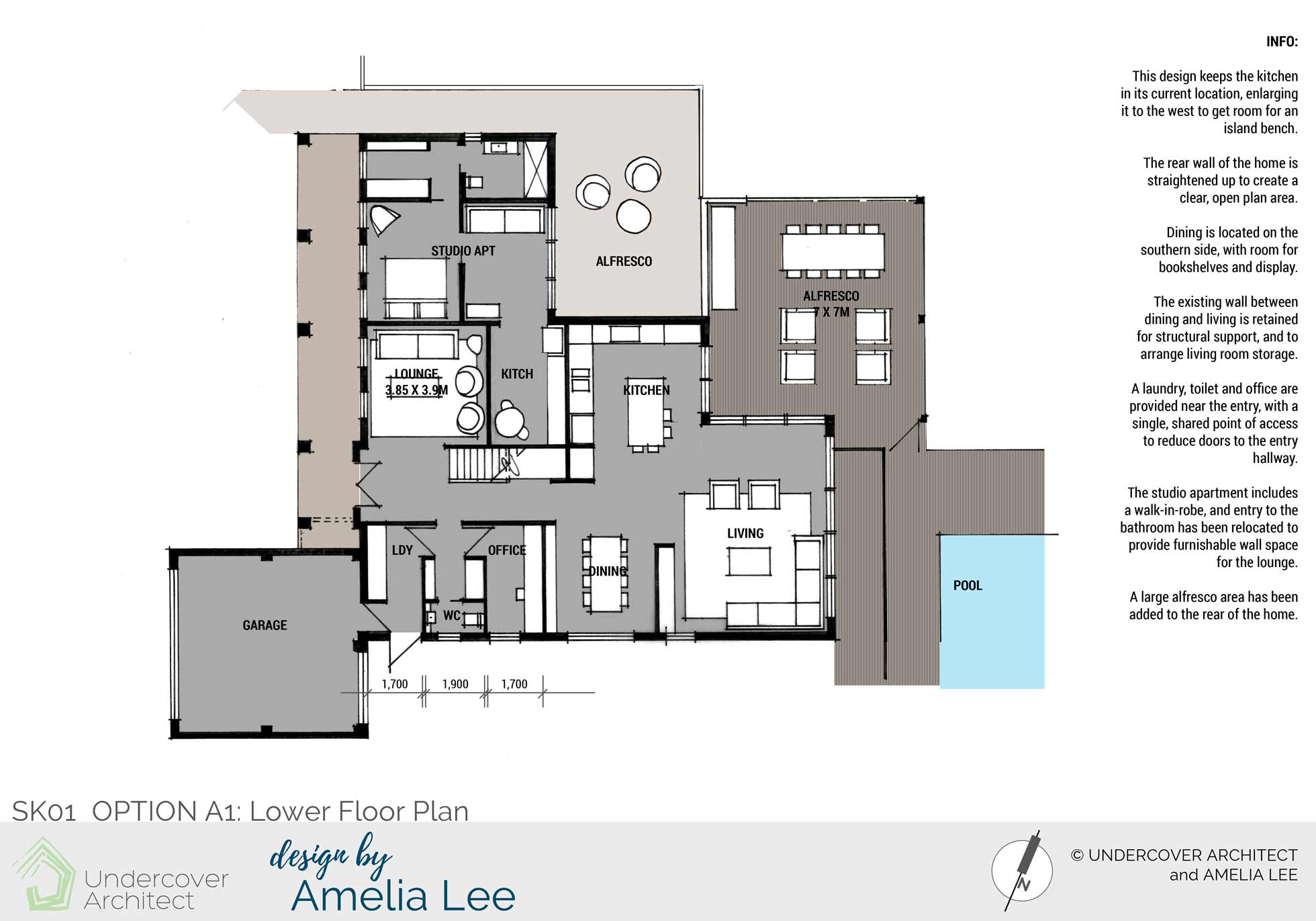
Option A1 Lower Floor Plan design keeps the kitchen in its current location, and enlarges it to the west to get room for an island bench. A large alfresco area is added to the rear, and is privatised from the self-contained apartment and its alfresco area. Structural walls are maintained, and a better arrival process from the garage is provided.
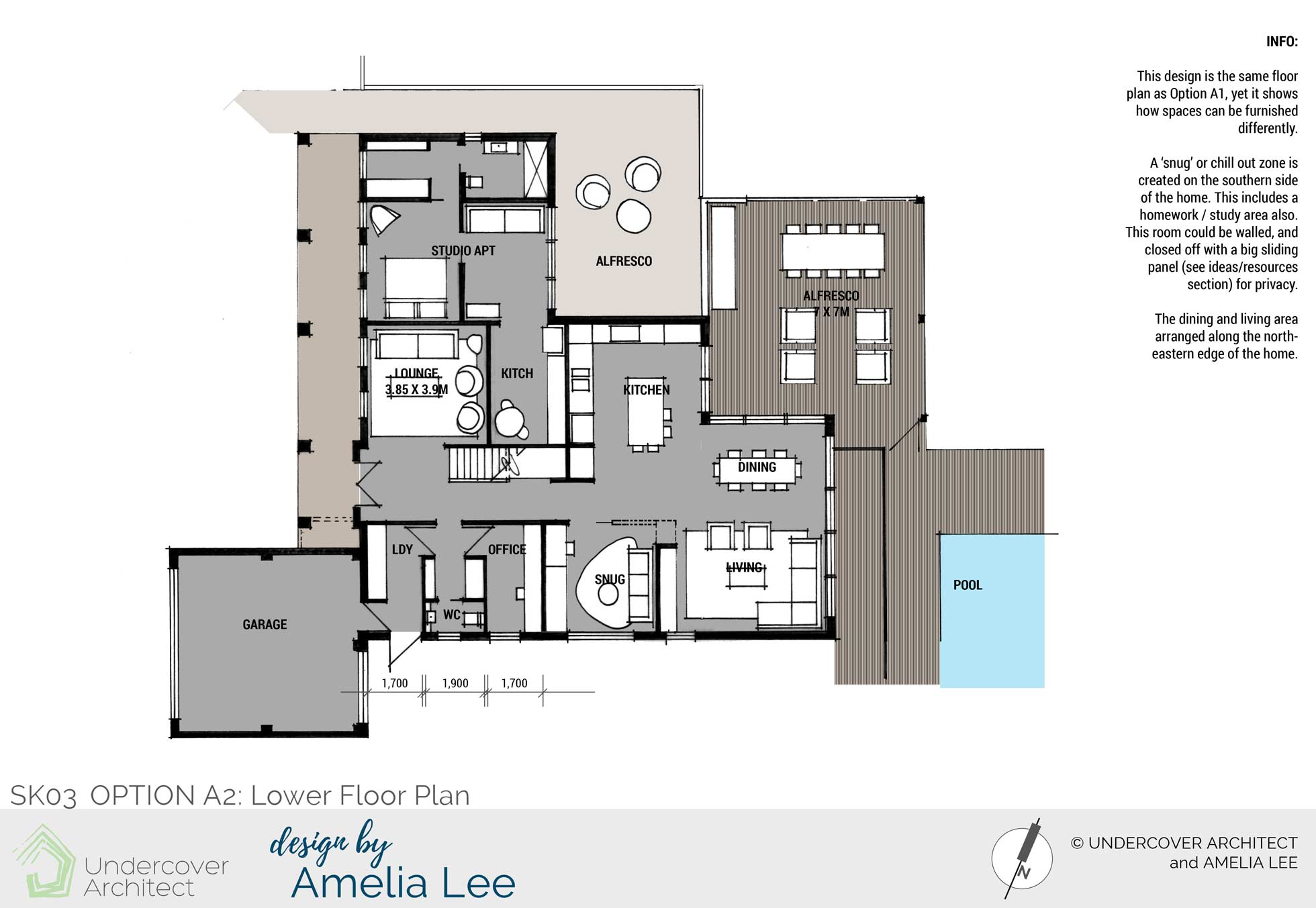
Option A2 Lower Floor Plan design is a similar layout, but shows how spaces can be furnished differently for different functions.
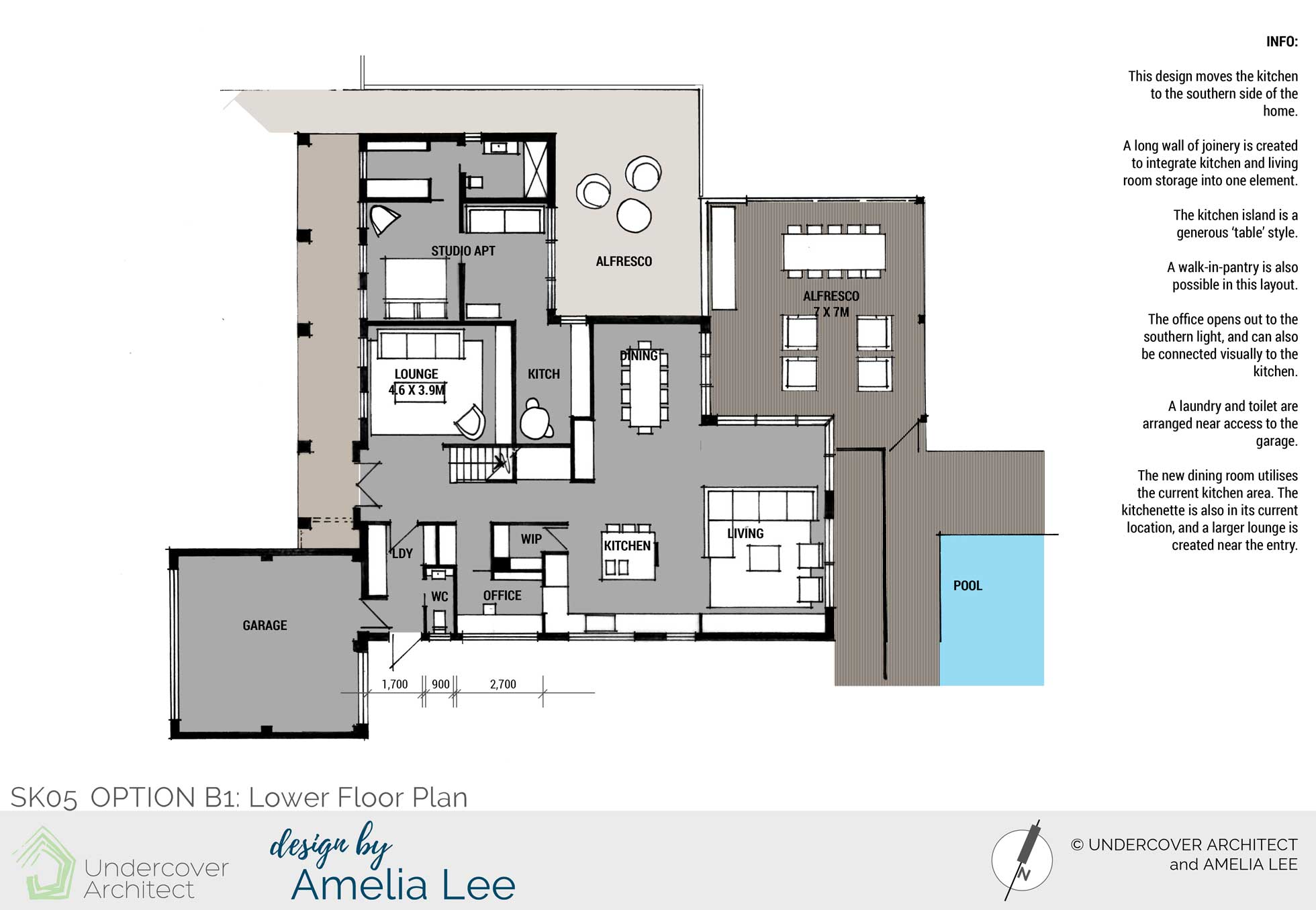
Option B1 Lower Floor Plan design moves the kitchen to the southern side of the home. A long wall of joinery is created to integrate kitchen and living room together. The kitchen island is a generous ‘table’ style with a blade element beside it to maintain existing structure. The entry from the garage is a different configuration from Option A1/A2 of similar functions.
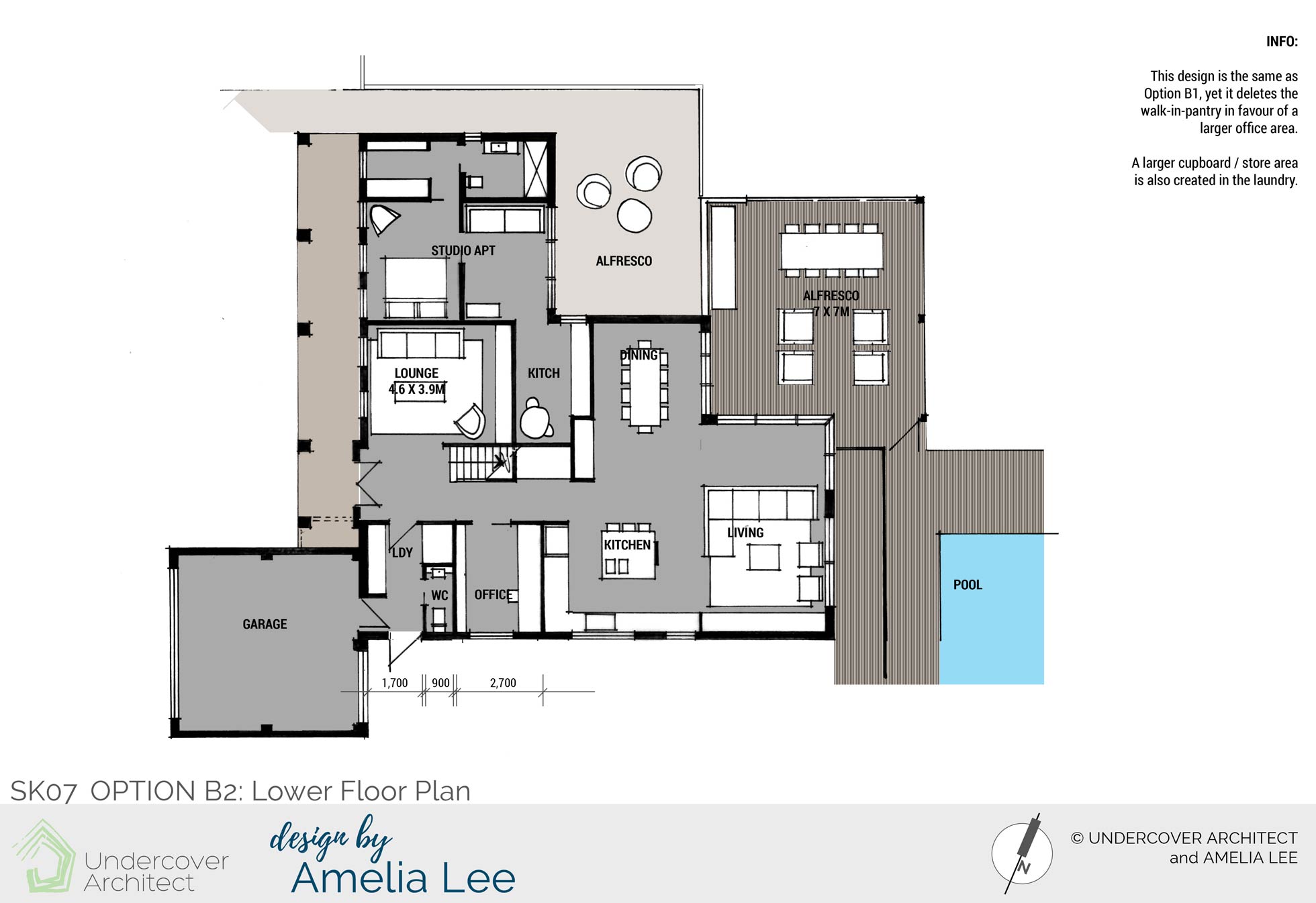
Option B2 Lower Floor Plan design is the same as Option B1, however it deletes the walk-in-pantry in favour of a larger office area.
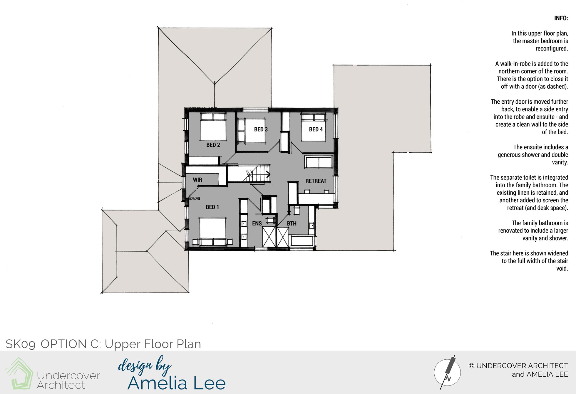
Option C Upper Floor Plan reconfigures the master bedroom to provide a larger walk-in-robe, and a rearranged ensuite. This is mainly to get entry into these rooms off walls near the bed. The retreat area is screened with storage, and the toilet integrated into the family bathroom.
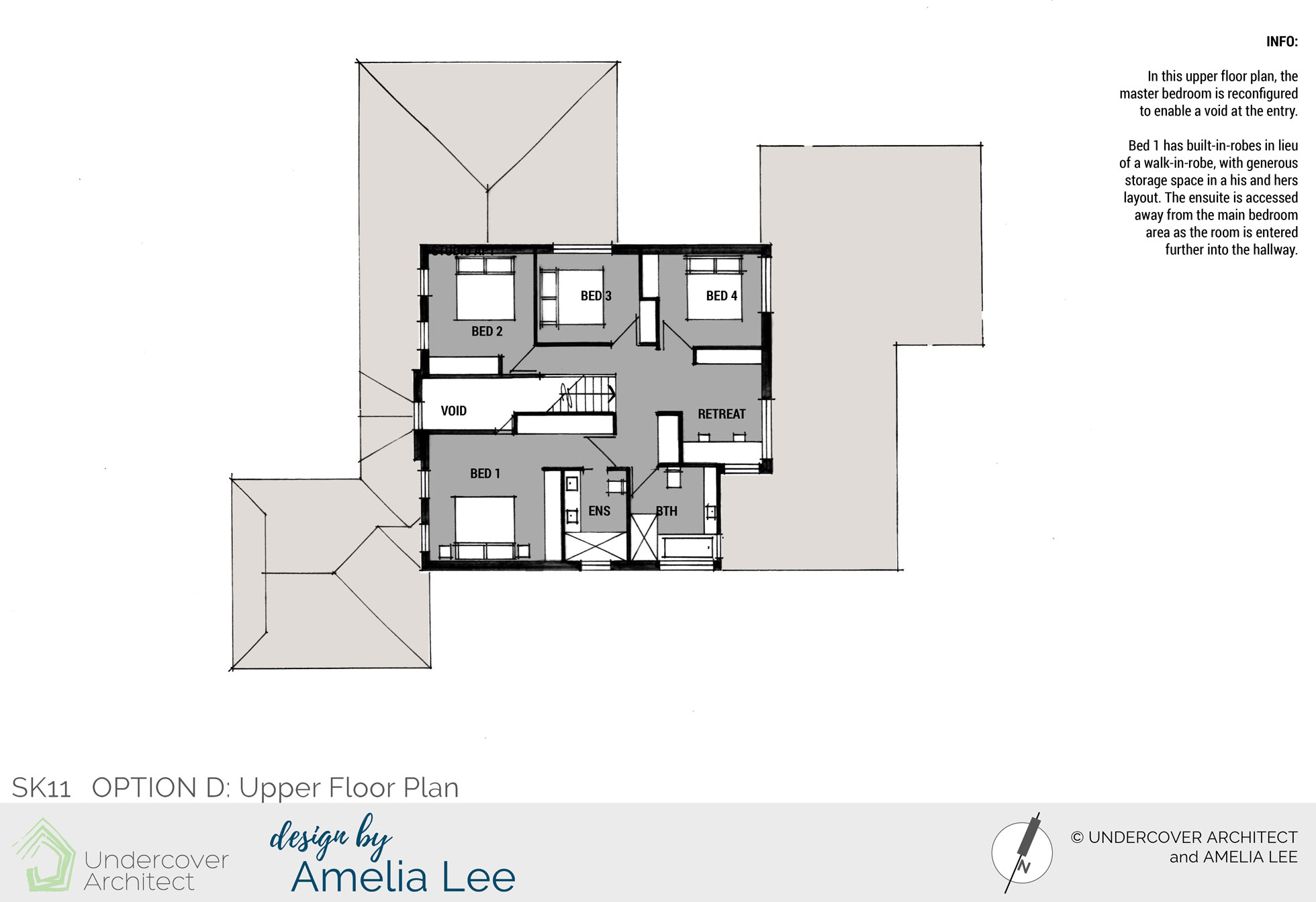
Option D Upper Floor Plan also reconfigures the master bedroom, this time to provide a void at the entry. Large built-in-robes are provided.
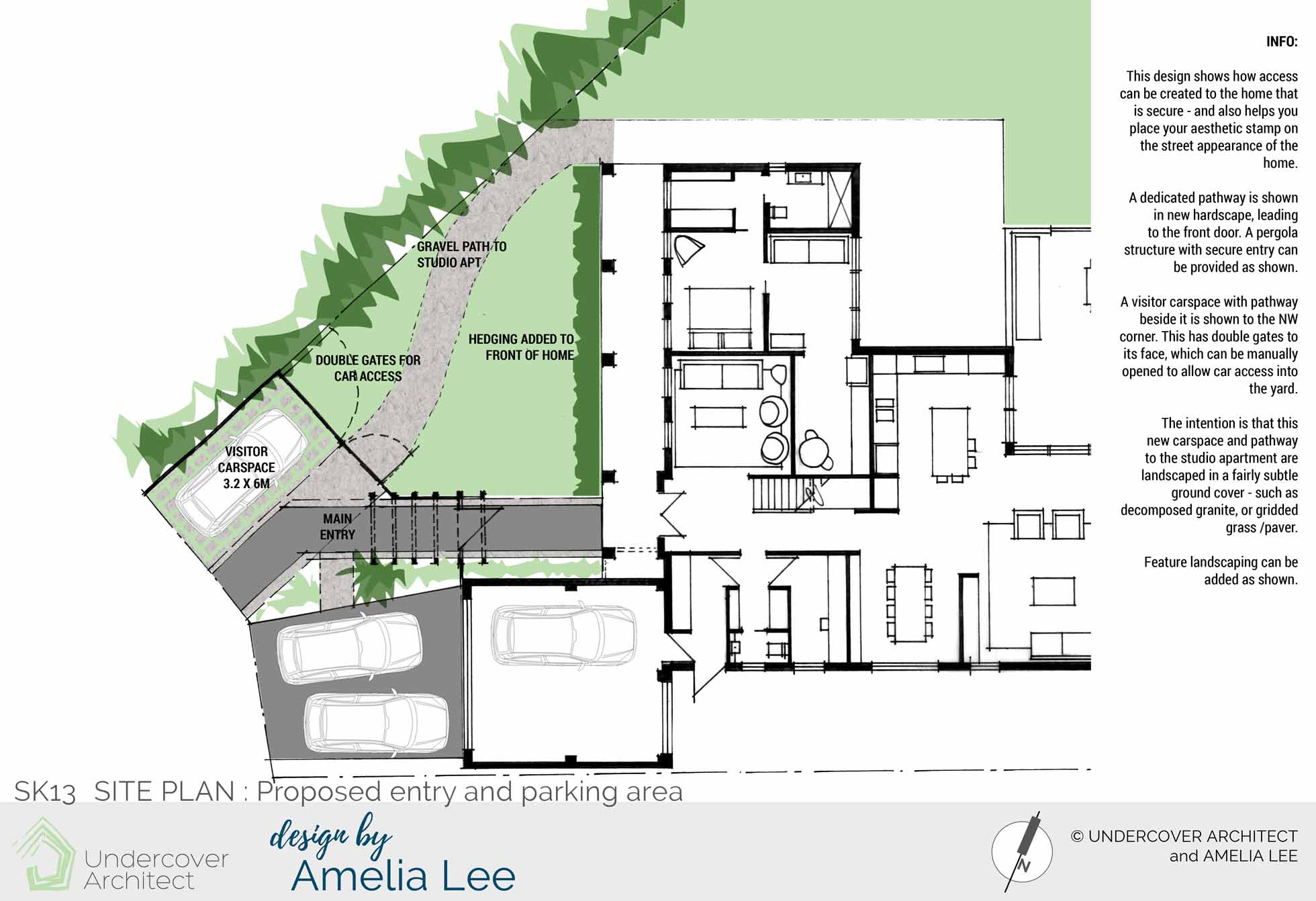
Site Plan design shows how secure access can be created to the home, which can also help the owners place their aesthetic stamp on the street appearance of the home. A visitor carspace (which is drive-through for ease of access to the yard when required) is also provided in the front garden.
The Verdict?
This is what Sue had to say about working with me:
“I know when we started out and I contacted you that [my partner] may have had some reservations about me “finding a woman on the internet who could help us.”
That changed as soon as he talked to you during our consultation. It was clear to him you had all the knowledge we would need and that your approach was really focused on a livable home, and not spending money we didn’t need to when with a little thought a more economical alternative could apply.
We were thrilled with the plans we received from you.
[My partner] was really impressed with the work you did – don’t often hear him blow someone else’s trumpet – but he was really pleased.
“She really knows what she’s doing”, in his speak that is equal to “she is a genius and I love her”. We were also really impressed with some of the solutions you gave us that had not even entered our head. Like putting the entry door to the granny flat bathroom via the end of the bedroom. Simple but genius.
There still remains a number of choices for us to make with regard to the full renovation and our initial focus will be to work on the kitchen/family room/outdoor area as the first chunk, and then continue from there.”
Amelia works 1:1 with clients through her boutique design agency, Design by Amelia Lee. To learn more about her services, head here.
The post Spotlight: Bringing coastal lifestyle back into a 1990’s Henley home appeared first on Undercover Architect.
