Want to know 4 powerful ways to use indoor / outdoor connections to create a spacious home? Make your home feel bigger with these tips and resources.
This is Episode 11 of Season 1.
In this last episode of Season 1, I uncover the 4th tool we have available to create spaciousness in our homes: Indoor / Outdoor Connections.
This first season of the “Get it Right” podcast has been taking you through what matters most.
These are the first and most fundamental choices and information you need to get it right in your new home or renovation. When you put these decisions first, then it simplifies the rest of the journey. It also helps you create a home that will feel great – and that you’ll feel great in.
As a client of mine once said “The wall costs the same, whether you put it in the right place, or the wrong place!” The same can be said for design generally. Great design isn’t any more expensive. It’s about having the knowledge to make the right choices, and making those choices first so you get to a great home at the end of your journey.
So how do you use indoor / outdoor connections to create spaciousness?
Many homeowners want to open up their home to bring the outside in. There’s the practical need to connect to their gardens, supervise their kids whilst they play, and make the most of our great climate here in Australia.
There’s also the desire to make our home feel larger, more light-filled and calm as well.
However, you don’t need a big block to make great indoor / outdoor connections. And cutting lots of holes in the walls of your home isn’t always the best approach either (that’s actually a surefire way to cause lots of additional costs in engineering and structure!)
There are 4 key ways to think about indoor / outdoor connections. When you approach your home design with these in mind, you can make sure you get results that work. I’ll take you through them in detail, and help you understand how to create spaciousness, whilst maintaining security and privacy in your homes as well.
Listen to the podcast now.
Here’s those 4 tips illustrated with other projects …
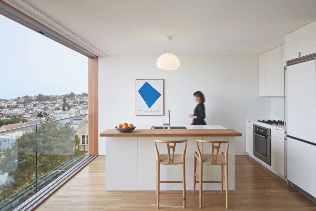
Tip #1: Borrowing space
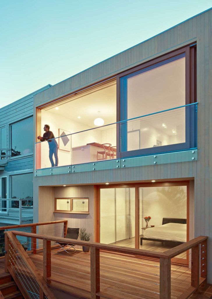
This project, designed by Ryan Leidner Architecture, does a great job of borrowing space. Adding a deck to the upper floor (and main) living areas would have impacted how the lower floor felt, and also added building bulk and construction issues. Instead, large sliding doors (which actually slide both ways) open the kitchen and dining area up to the amazing view. A balustrade fixed to the outside deals with safety issues. With the doors open, the kitchen and dining area feel like an external space. It’s a stunning result. [Image Source]
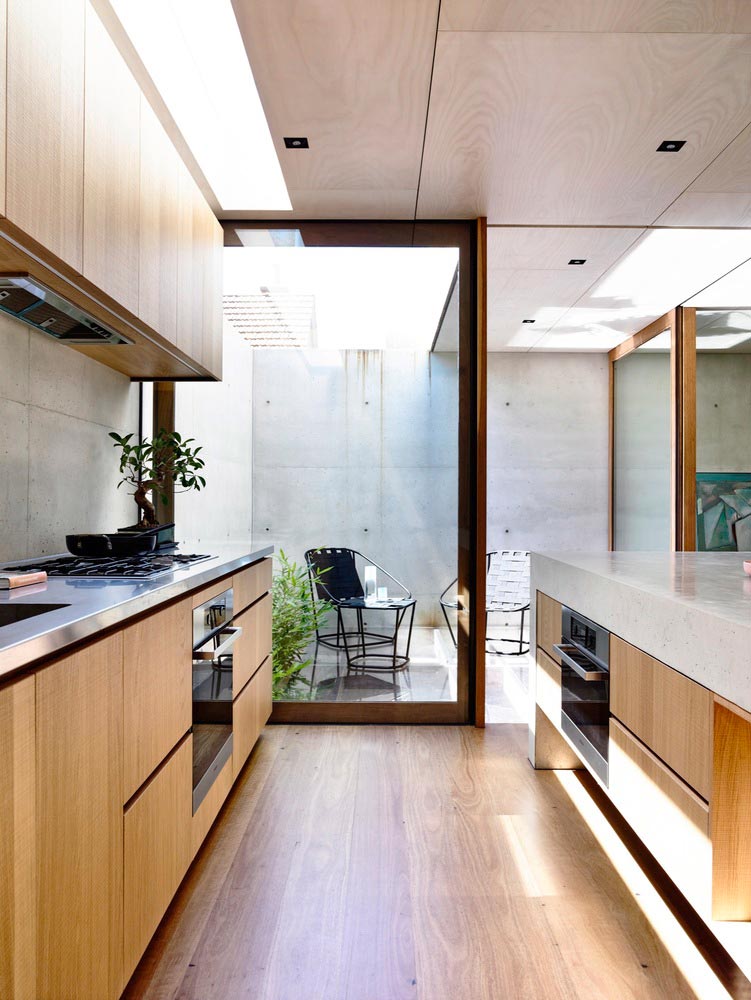
Tip #2: Borrowing light
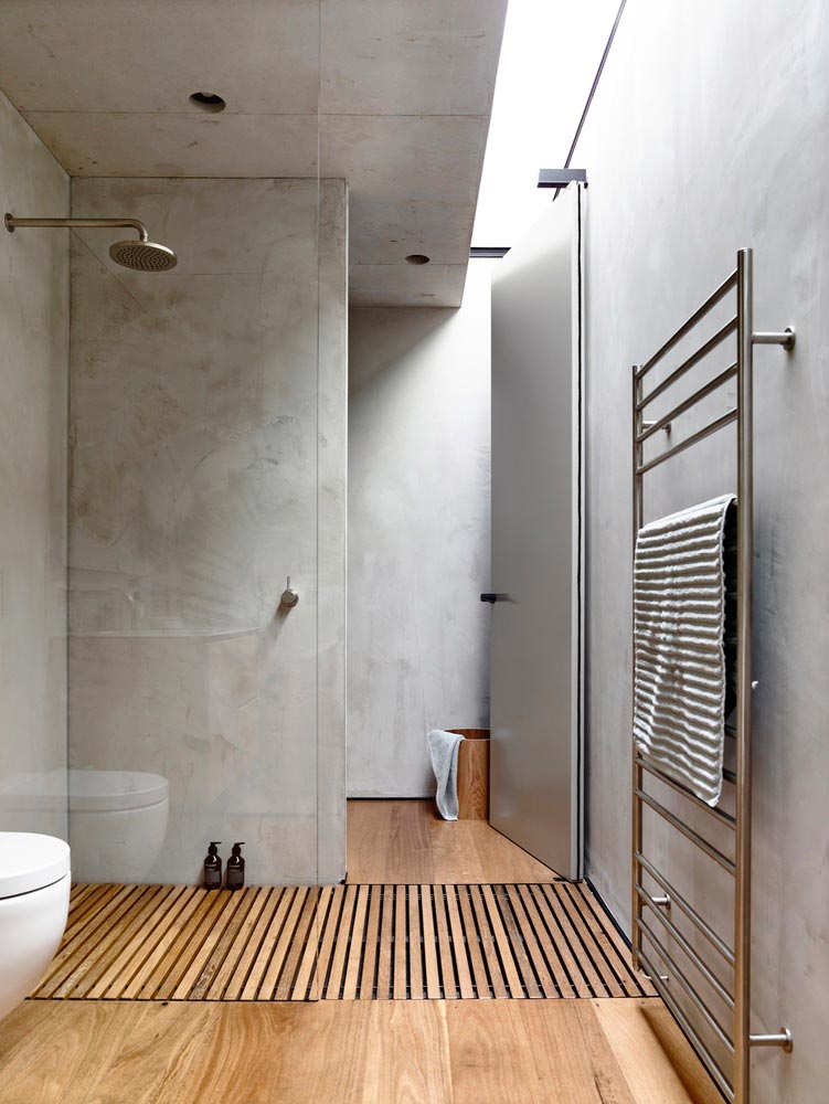
This home, designed by Schulberg Denkiw Architects, uses skylights to create great surprise and delight in this compact home – as well as functional natural light. These sliver skylights wash the interior spaces with sunlight. A direct view is only available when standing right under them though. The light great enhances the sense of indoor / outdoor connection, and opens up the home to beyond its reach – but keeps the view out a secret until you look for it. [Image Source]
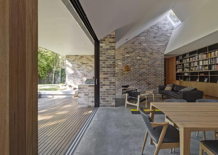
Tip #3: Creating sight lines
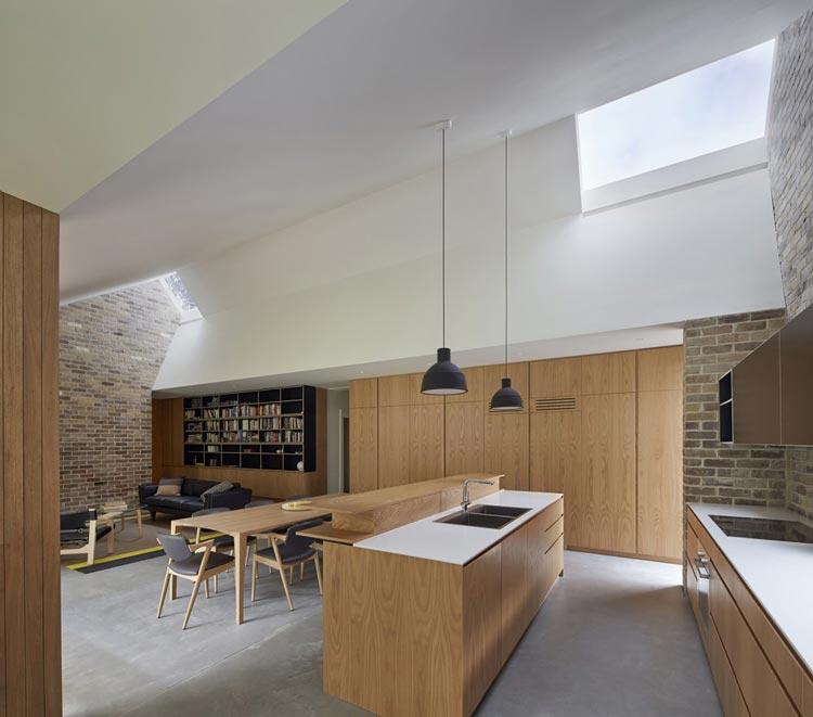
Known as the “Skylight House” (designed by Andrew Burges Architects), this home is dramatically enlarged by the idea of creating sight lines. One side opens up to the garden. The other side expands with a view to the sky, which is completely privatised from overlooking, but greatly enhances the sense of spaciousness, natural light and connection to outdoors. [Image Source]
Tip #4: Cutting sight lines
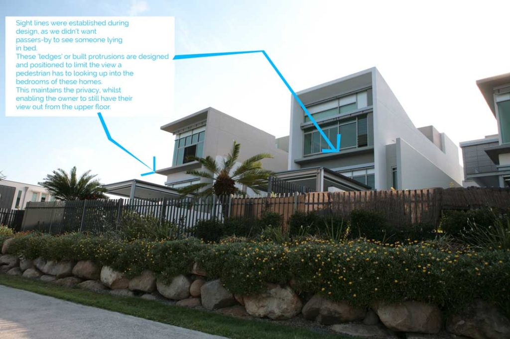
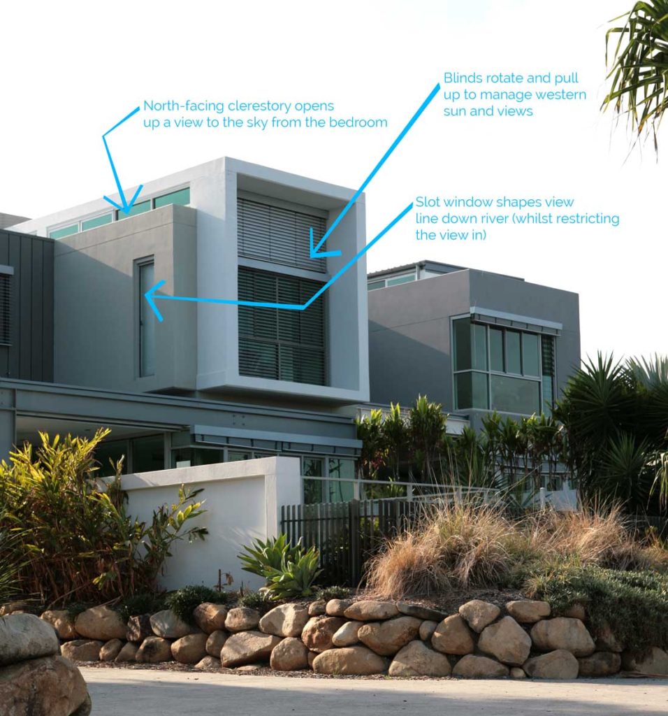
These riverfront homes (designed by me, Amelia Lee, whilst at Mirvac) were an study in sight lines! With an incredible river view, they sit on a publicly accessible riverwalk. So, these homes essentially have two frontages – and some even have three.
We used levels to sit the homes above the riverwalk, and help separate it from views in with landscaping and fencing up on these platforms. In more private areas on the upper floor, we used window positions and sizes to shape the view in certain directions, but limit the views in.
We also used protruding ledges to literally block the view in from pedestrians … so that passers-by could not see the homeowner lying in their bed (even when they had the blinds open). We also used external motorised blinds to manage western sun and privacy.
Here’s some more resources for you …
Read this blog for 7 tips before choosing your windows and doors for your home
Read the Project Diary of our Queenslander Cottage renovation. This home utilises a few of these design tricks to create spaciousness – namely an internal dining area that doubles as a ‘deck’, and a large, north-facing clerestory, to ensure light can be borrowed into the south-facing extension.
This project, which sits on a corner, uses the building to screen views into upper floor bedrooms.
This home uses battened screens to shield the view into neighbours (and vice-versa) whilst still ensuring the home feels spaces by bringing the outdoors in, and opening up to northern light (on a south-facing site).
This is the last episode of Season 01. Remember to check out the rest of Season 01 to learn What Matters Most when designing your new home or renovation. Look out for Season 02 intro next week (and subscribe so you don’t miss it).
The post Creating Spaciousness: Indoor Outdoor Connections appeared first on Undercover Architect.
